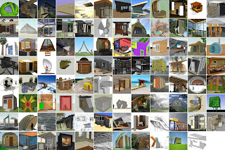
Design It: Shelter Competition update

Wednesday, July 29, 2009

The Design It: Shelter Competition launched about six weeks ago, and the response so far has been phenomenal. You owe it to yourself to visit the Guggenheim website to check out the projects that have been submitted so far – almost 100 and counting.


By no means is it too late to participate – the competition doesn't close until August 23rd. Check out the website for all the juicy details. The ghost of FLW (along with the rest of us) can't wait to see the fruits of your creative genius.

New online training for SketchUp Pro 7 customers

The folks at Go-2-School just launched a new way to get trained on SketchUp - an online service called Pro Accounts. A Pro Account gives members online access to Go-2-School's entire video library, which includes their DVDs and webinars, as well as access to one live Q&A session per month and a few other perks.

They're also offering a special promotion for SketchUp Pro 7 customers. If you own a Pro 7 license, you can sign up for a monthly or yearly Pro Account membership at a 50% discount. You can find more information about the promotion on their website.

A SketchUp contest just for kids

Monday, July 27, 2009

Our friends over at Architect Mason Kirby Inc have just announced a SketchUp design contest for kids! Since we know how much kids love SketchUp, we'll be anxious to see what they create. The theme is “under/over/within” and features an intertidal aquatic site:


Parents will need to lend a hand with the registration process and uploading the models, but Architect Mason Kirby Inc has provided a base model to start from for the design part. If you're 15 years old or under, you're eligible to enter. We'll post the winners here in late September. Good luck!

Posted by Allyson McDuffie, SketchUp for Education Program Manager

Calling all teachers: Help!

Friday, July 24, 2009

Alright folks – I need your help. I'm traveling to Tokyo next week to give a speech for 1000 Japanese primary and secondary school teachers. I want to show them some examples of interesting things people are doing with SketchUp in K-12 education. I know there's a ton of math, history, geography, architecture and other great stuff out there, but I don't meet enough teachers in person to collect it myself.


If you (or anyone you know) is an educator with something SketchUp-related that might be of interest to teachers, I'd love to see it. Lesson plans would be great, but images, SKP files, and brief explanatory paragraphs would work, too. I won't distribute or publish anything without asking permission, so please don't worry about that : )

Please send whatever you've got to sketchupblog@gmail.com by Friday of next week. Thanks!

Posted by Aidan Chopra, SketchUp Product Evangelist

Killen•WOOD: Increasing woodworking productivity with SketchUp & LayOut

Thursday, July 23, 2009

Tim Killen of Killen•WOOD has found that SketchUp and LayOut are effective tools to help woodworkers become more efficient and better builders. After retiring in 2005 from the Bechtel Corporation where he served for 36 years in the management of engineering and IT projects, Tim's focused much of his energy on his interest in the field of woodworking.


Whether he's hands-on in his woodworking studio, contributing to the Fine Woodworking weekly Design. Click. Build blog, or instructing one of his many woodworking courses, Tim has incorporated SketchUp and LayOut into his work. He uses the software to resolve technical issues, communicate more effectively, and become a more productive woodworker in general.
"Before SketchUp and LayOut, I relied on 2D software and 2D drawings for my projects. Unfortunately, individual 2D drawing can be difficult to interpret and may not supply enough information – especially in the case of complex joinery. The 2D drawings that I took to the shop were often rough, introduced more errors and had to be sorted out in the shop resulting in unnecessary re-work before getting to the point of actual construction."

Tim found that any type of pre-visualization of his projects was also time consuming. Exploded views, close-ups of joint details, full-size templates or any other custom view of the project could not be seen without creating another special drawing. He was also unable to extract any quantities or cut lists from his drawings.

Tim now takes advantage of 3D models produced with SketchUp to improve his workflow in the shop:


"There are numerous advantages to having created a complete 3D SketchUp model first in the computer before moving to the shop. The model inherently provides a much higher quality of design and documentation.

The construction process is much more straightforward after having 'built' the piece as a 3D SketchUp model. There are less mistakes and re-work. So it is saves me time, frustration, and materials.

From one SketchUp model I can produce multiple orthographic views (front, side, top), assembled and exploded views, one or more views of different details, full-size templates and even cross-sections."

Exploded Views

"My own productivity has improved greatly. Even though I spend a bit of time detailing my models, I make it up in the shop. I can count on the dimensions being right in my documentation which has reduced re-work. Also, with LayOut, I produce many more full-size templates since having the SketchUp model. These templates help to accurately layout details and reduce measurement errors... Now I will not go to the shop without having modeled first in SketchUp."

Full-Size Templates

Tim's use of SketchUp and LayOut has also become an essential part of his woodworking course curriculum:
"All the SketchUp models and the resulting LayOut documentation ( drawings and templates) I produce are exported to PDF and distributed via email to my students. They can then print the project documents and full size templates at their local FedEx Office for the class.

SketchUp has given me confidence in tackling more complex projects both at home and with my students in my course. I’ve been able to extend my teaching ability and the students are benefiting greatly. With SketchUp in the curriculum, the students are not chasing problems with 2D drawings and doing ad-hoc re-design. Instead, we can focus on the important woodworking processes of creating parts, joints, and assemblies. Over all, the students are much more competent and are producing more complex, higher-level work."

You can download an example of Tim Killen's work; he's provided some documentation for a Connecticut Stool (below) for you to view: LayOut file (.layout) or PDF file (.pdf)


Cities are getting on the virtual map

Wednesday, July 22, 2009

Proud citizens around the world are modeling their cities in 3D. A glance at the Cities in Development collection in the Google 3D Warehouse shows upwards of 500 cities, towns, and locales being modeled. There's at least one 3D city on every continent, including Antarctic research stations.

The Cities in Development collection enables geo-modelers to communicate with like-minded citizens who'd like the world to visit their city, town, village, suburb, hamlet, borough, burg, or sub-zero laboratory in Google Earth.

Working with Google Earth satellite imagery, building photographs, and Google SketchUp, these modelers are literally putting their cities on the map. Working alone or collaborating with folks they meet via 3D Warehouse, these users collect models together to show off their progress.

A very elegant example is the city of Florence where 41 of the most historic and beautiful architectural gems have been brought to life in 3D. Each building model (created by seven different lovers of the city) can be downloaded on its own, or the entire collection can be viewed in Google Earth by clicking on the "View in Google Earth" link. While you are there, you have to check out the amazing Villa di Poggio Imperiale a Firenze.


It's hard to compete with classical Florence, but a 3D model of Blackfoot, Idaho is cool in its own way. We love authentic American movie theaters with their deco marquis, and the Nuart Theatre is a classic example!

Visit Your World in 3D to find out more about modeling for Google Earth.

SketchUp goes to the Moon!

Monday, July 20, 2009

With the launch of Moon in Google Earth today, you can now explore our nearest celestial neighbor from within Google Earth. Beginning in 1959, we began to send probes and landers to the lunar surface, and most of them remain there to this day.


Many of these objects have been modeled in Google SketchUp, and are based on drawings, photographs, and dimensions. One model that has a prolific presence on the Moon comes from Google 3D Warehouse model contributor, Pagan. This user modeled the Apollo Lunar Module and it is featured at each of the Apollo mission landing sites, as well as in the guided tours.

To view these models in Google Earth, first switch to Moon via the planetary drop-down menu at the top of the screen.


Next, expand the "Moon Gallery" in the left Layers panel.

From here you can virtually visit a variety of artifacts, spacecrafts, and mission landing sites by double-clicking on any of the models listed. Here are some examples of what you can find:


Apollo 11 Landing Site


Lunokhod 1 and Luna 17

Lunar Rover

You can also view these models in SketchUp by downloading them from our Moon Objects collection in the Google 3D Warehouse. Happy exploring!

Fly yourself to the moon

(Cross-posted from the Google Lat Long blog)

On July 20, 1969, two human beings landed on the moon for the first time. Forty years later, that accomplishment still stands as an unmatched moment in the history of human exploration. It was a truly wondrous event that captured imaginations worldwide -- nearly a billion people (one quarter of the Earth's population at the time) followed it moment-by-moment on live TV or radio, around the globe.

Today, on the 40th anniversary of the Apollo 11 landing, Google is proud to announce the release of Moon in Google Earth, bringing you one step closer to understanding the experience of standing on the moon. It brings the Apollo stories out of the history books, recreating them in an immersive and interactive 3D environment.

To see for yourself, all you need is Google Earth 5.0 (if you already have it, no upgrade is required). Just click the planet button on the top toolbar of Google Earth, and choose Moon. You'll be flow to the Moon, at which point you have all the same usual Google Earth controls -- drag your mouse on the globe to fly around, and use the Layers panel in the lower-left corner to discover content. Double-click any Layers item to fly to it.


Each of the Apollo landing missions is chronicled in detail through pictures and stories. We've even embedded video footage from Spacecraft Films that covers the most well-known moments on the surface. There are also immersive lunar surface panoramas, composed of photos taken by the astronauts themselves, presented for the first time in a 3D "Street View" style interface:


The Human Artifacts layer contains locations and trivia on every robotic spacecraft that's ever landed on or crashed into the moon. Those that did land successfully are represented by 3D models, such as Luna 9 from the USSR:


You can turn on the Historical Maps layer to see maps that NASA itself used in the Apollo missions. Or just fly around and explore the 3D terrain:


If you get lost, that's no problem... just pull up the Guided Tours layer. There you'll find author Andrew Chaikin (A Man on the Moon) and Apollo 11 astronaut and author Buzz Aldrin (Magnificent Desolation) co-narrating an immersive fly-through tour of the Apollo 11 landing site. Harrison H. Schmitt, Apollo 17 astronaut and Fusion Technology Institute faculty member, is also on hand to describe his experience as the only geologist to have walked on the Moon.


The tours are like a movie, but better... when you pause, you can actually look around with the camera! See the Google Earth User Guide for more info.

Moon in Google Earth was made possible by Google's Space Act Agreement, which allowed NASA Ames researchers to help us develop much of its content. We're also grateful to JAXA, Japan's space agency, for donating a global terrain dataset of the Moon.

We hope that you enjoy Moon in Google Earth. Explore it today, in observation of the 40th anniversary of one of humanity's finest moments.

Michael Weiss-Malik, Product Manager, Moon in Google Earth

A whole pile of SketchUp 7 books

Friday, July 17, 2009

Books about Google SketchUp 7 are popping up everywhere. Without making any recommendations, and in order of publication from most to least recent, here are some of the ones that are available now:

Google SketchUp: The Missing Manual
by Chris Grover
Beginner/Intermediate
Published June 2009 | List price $34.99
Available from: O'Reilly | Amazon | Google Product Search


Google SketchUp Cookbook: Practical Recipes and Essential Techniques
by Bonnie Roskes
Intermediate/Advanced
Published May 2009 | List price $49.99
Available from: O'Reilly | Amazon | Google Product Search


Google SketchUp 7 For Dummies
by Aidan Chopra
Beginner/Intermediate
Published March 2009 | List price $24.99
Available from: Wiley | Amazon | Google Product Search


Google SketchUp 7 Hands On: Basic Exercises
by Bonnie Roskes
List price $71.95 (color) & $57.95 (black & white)
Available from: 3DVinci


Google SketchUp 7 Hands On: Advanced Exercises
by Bonnie Roskes
List price $67.95 (color) & $54.95 (black & white)
Available from: 3DVinci


And that's not all, folks. There are at least two more publications coming down the line:

Google SketchUp for Site Design:
A Guide to Modeling Site Plans, Terrain and Architecture

by Daniel Tal
Scheduled for Publication: August 17, 2009 | List price $49.95
Available from pre-order from: Wiley | Amazon | Google Product Search


Real World Google SketchUp 7
by Mike Tadros
Scheduled for publication: November 9, 2009 | List price $49.99
Available for pre-order from: Amazon | Google Product Search


Update: There's also Portuguese language book available for SketchUp 6 – a version that covers SketchUp 7 will be available in late August (according to the authors).

Posted by Aidan Chopra, SketchUp Product Evangelist

He made a music video with SketchUp?

Wednesday, July 15, 2009

A music video is currently making the rounds of the office. Ooooh and aaaahs and catchy beats resonate from every corner...


Dave Righton, the Canadian one-man-band member of Roche Limit, apparently ran short of funds while producing his song "My Friend Ship". He was using SketchUp to storyboard ideas when he came to the realization that he could just do the whole thing in SketchUp – too cool. The whole thing cost him something like $12 to make.

I think it's beautiful, and if I could carry a tune in a bucket, I might be inspired to do likewise. Here's a video that features Dave talking about his process:


Posted by Aidan Chopra, SketchUp Product Evangelist

The results are in, and they are beautiful

Thursday, July 9, 2009

Wow! We received some amazing entries for the Google SketchUp 2009 International Student Bridge Modeling Competition. Higher education students from over 65 countries registered for the competition, 42 collections were created in the Google 3D Warehouse, and 77 bridges were modeled from all over the world. The types of bridges range from historical to pedestrian, rail and highway - and they were all certainly impressive. Check out our winners page for details and comments from our illustrious panel of judges.

The winners are:

1st Place
Jason Wong
School of Architecture and Construction Management, Washington State University, US

2nd Place
Tobias Merk
School of Design, Hochschule Augsburg - University of Applied Sciences, Germany

3rd Place
Nicholas Falbo
Nohad A. Toulan School of Urban Studies & Planning, Portland State University, US


Keyboard tricks and shortcuts in LayOut

Wednesday, July 8, 2009

Just like in Google SketchUp, there are keyboard modifiers that let you control how LayOut functions while you are creating your LayOut designs. Below are a few that you may not know about.

Copying a selection

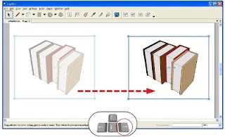
Similar to SketchUp, you can Copy/Move a selection by holding down CTRL (Option on a Mac) while moving an object.


Nudging items on a page

Using the arrow keys on your keyboard allows you to move your selections up, down, right and left in precise increments. The distance of each "nudge" is determined by your document's unit settings:
  • Metric: move in increments of 0.5 mm
  • English (inches and feet): move in increments of 1/64"
  • Points: move in increments of 1 pt
You can also hold down Shift (along with an arrow key) to nudge in bigger increments:
  • Metric: move in increments of 5 mm
  • English (inches and feet): move in increments of 1/4"
  • Points: move in increments of 10 pt
Scaling a selection

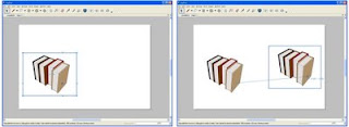
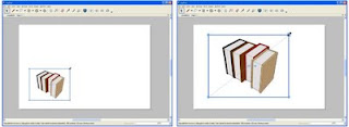
Holding down Shift while resizing a selection window allows you to scale your selection proportionately. If you use Shift in conjunction with Alt (Command on a Mac), your selection scales proportionately about its center.


Modifying lines, arcs & curves

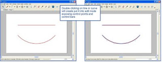
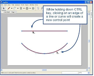
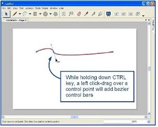
You can edit the shape and direction of lines and arcs by double-clicking to edit them. While in edit mode, you can add control points and convert lines into Bézier curves by holding down CTRL when you click them:


Double-click on line segments or arcs to edit them.


While editing, click while holding down CTRL (Option on a Mac) to add control points.


While editing, left click-drag on a control point while holding down CTRL (Option on a Mac) to add Bézier handles, and to convert a line into a Bézier curve.

Sampling Styles

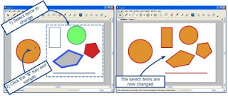
Tapping S allows you to sample the style of an existing object and apply it to a selection:


  1. Select the items you want to change.
  2. Tap S on your keyboard and click any entity to sample its style properties. Bingo! Your selection automatically takes on the new style. This works on any object on the page, including shapes, text and labels.
You can also sample a style while you're in the middle of using any 2 or 3-click tool – Rectangle, Circle, Line and Label, for example:
  1. Click once to place your first point.
  2. Tap S and click to sample another object on the page.
  3. Finish whatever element you're drawing. It should have all the style properties of the object you sampled in Step 2.
Note that tapping the S key isn't a shortcut that activates the Sample tool; it's a special mode that works while you're in the middle of using another tool.

Rubah blog anda menjadi DOFOLLOW

Tuesday, July 7, 2009

Assalamualaikum wr.wb
Berhubung blog dok ini sudah dofollow, maka dok ini berbagi ilmu dan pengetahuan yang dok dapat, caranya sangat mudah koksengihnampakgigi, tapi sebelum kita mulai, arti dari dofollow itu sendiri adalah jika seseorang berkomentar di blog kita maka akan masuk dalam kantong jeng google (search engine), ini akan menguntungkan anda yang mempunyai blog, karna comment di postingan akan tersearh oleh mbah surip google, lumayan nambah pengunjung bukan.


naphkeuntungan dari yang mengomentari postingan kita, akan mendapat LINKBACK secara otomatis, ini akan membuat pengunjung blogger, ingin berkomentar di blog kita, intinya " yang berkomentar dan yang di komentar ( blog ) sama-sama akan mendapat untung ada budisengihnampakgigi

* Sig in ke blogger

* Masuk ke LAYOUT --- > EDIT HTML ( ingat centang ) nyontren sebentar ingat juga tu

* Cari kode ini :

<a href="data:comment.authorUrl" rel="nofollow">


Klw gak ketemu cari yang ini :

<a href='data:comment.authorUrl' rel='nofollow'>


NB : BEDA ADALAH TITIK ATAS

* Lalu ganti dengan kode ini :

<a href='data:comment.authorUrl'>


<a href="data:comment.authorUrl">


* Lalu SAVE

Untuk memberitahu pengunjung bahwa blog anda DOFOLLOW silahkan copy/paste gambar ini, DALAM KOTAK ITU KODEnya iaialah


dokter dofollow 2


<center><a href="http://dokterblogtips.blogspot.com" target="_blank"><img border="0" alt="dokter dofollow 2" src="http://i580.photobucket.com/albums/ss241/nobhita/ifollowblue.png"/></a></center>

Membuat LINK terbuka di new windows

Monday, July 6, 2009

Bila kita membuat link di blog/postingan kita, semisal TUKARAN LINK, jika pengunjung mengklik link teman anda, maka akan terbuka diblog anda, otomatis blog anda ditinggalkan, itu akan membuat kita rugi beberapa juta, jadi untuk membuat pengunjung tetap pada blog kita walaupun dia mengklik link teman kita, caranya gampang banget :

Dokter blog mahh langsung ngasih, gak pelit dan gak sombong nyinggung blog tutorial yang lain ni dok??sengihnampakgigi

Ini kodenya :

<a href="http://dokterblogtips.blogspot.com" target="_blank">Dokter Blog</a>


Maka hasilnya gini :

Dokter Blog


Atau ingin gaya yang kayak gini :

Dokter Blog


Mirip ni dengan membuat TEKS berkedip ( yang belum tau klik disini )


<blink><a href="http://dokterblogtips.blogspot.com" target="_blank">Dokter Blog</a></blink>

Masih mau ???

dok beri lagi nihh :

Dokter Blog


yang ini mirip sama membuat teks salah ( yang belum baca klik disini )

Semoga bermanfaat !!

Ingat comment yaa,, blog dok ini suka menganut ajaran sesat u comment i follow, artinya jika anda comment di sini, anda akan mendapat LINKBACK, lumayan tok naikan pagerank dan alexa rank ( yang pengen meningkatkan alexa rank dan pagerank, klik disini
)

Membuat daftar isi postingan

Saturday, July 4, 2009

Assalamuallaikum wr.wb
Jika anda tidak ingin memasang arsip pada blog anda, emang sich kelihatan norak, Arsip gunanya memperlihatkan kegiatan nulis/postingan kita, dalam bentuk TANGGAL, bukan tulisan, tapi jika anda ingin membuat daftar isi dengan tulisan kayak buku gitu kayak blog dok ini , caranya gampang - gampang susah sichhh
Langsung aja :

* Sig in ke akun blog anda (pastinya)

* Setelah anda Sig in, masuklah ke LAYOUT ---> ADD a Gadget

* Copy/paste kode berikut

<div style="overflow:auto; padding:5px; width:300px; height:200px; background-color: #fff); border:1px solid #fff;"><style>
.list {
border-bottom:1px dotted $mainTextColor;
line-height:1.2em;
padding:3px;
}
</style>

<div style="overflow:auto; padding:3px; margin:0px 0px 0px 0px; width:280px; height:180px; background-color: $mainTextColor; border:1px solid $mainTextColor;">

<div class="list">
1. <a href="http://dokterblogtips.blogspot.com/2009/06/cara-membuat-blog.html">Cara membuat Blog + templates modern</a></div>

<div class="list">
2. <a href="http://dokterblogtips.blogspot.com/2009/06/menambahkan-url-pada-google.html">Memasukan blog ke google</a></div>

</div></div>


# Warna Hijau Ukaran Lebar Kotak ( Silahkan sesuaikan )

# Warna Biru Tingginya Kotak ( Silahkan sesuaikan )

# Warna Kuning Tinggi Tulisan ( Silahkan sesuaikan )

# Warna Ungu Lebar Tulisan ( Silahkan sesuaikan )

# Tulisan Tebal, ganti dengan LINK POSTINGAN anda

Jika anda ingin menambahkan lagi, daftar isinya, 4 , 5 atau seterusnya,
COPY/PASTE kode yang ini :

<div class="list">
1. <a href="http://dokterblogtips.blogspot.com/2009/06/cara-membuat-blog.html">Cara membuat Blog + templates modern</a></div>

Jangan lupa kode terakhirnya :

</div></div>


Lalu SAVE dechh, lihat hasilnya !!!

Tips mempercepat loading blog

Assalamuaikum wr.wb
Dokter ngepost lagi, setelah dok cape dengan urusan dunia nyata, sekarang dok ada di dunia maya, kemarin dok ditanya sama teman dok, dia bilang gini "dok, ada tips dan trik mempercepat loading pada halaman blog???, terus dok jawabnya simple "banyak berdoa" "aku pelajari dulu", setiap ada masukan dari teman, entah itu masalah blog, bisnis, atau apalah, pasti dok rus pelajari dulu iaiaialahhhhh dok.
Setelah dapat tips meningkatkan alexa rank (yang belum baca klik disini, oh ia dok akhirnya dapat rezeki dok di review, lumayan buat beli bakso, yang pengen ikutan bisa gabung disini,
Lo??? kog ngomongin ini yaaa,, sengihnampakgigitanduk

oke langsung saja begini tipsnya tepuktangan :

* Jangan menaruh GAMBAR/IMAGES yang banyak pada blog, itu akan membuat halaman blog kalian lambat dan berat

* Usahakan postingan yang muncul pada HALAMAN depan sedikitnya 4-5 postingan aja, agar pas di buka pengunjung tidak lambat atau ribet mau baca yang mana, saya sarankan pake daftar isi aja seperti punya dok (yang belum tahu klik disini)

* Banner/iklan/atau macam" pernak-pernik, diusahkan jangan terlalu banyak, yang diperlukan saja, seperti shoutbox, yang belum punya klik disini

* Bagi yang pake Mozilla Fifefox Tambahkan ( add-ons ) tweak pada Firefox anda, klik disini buat instal di Mozilla Fifefox, restar dulu Firefox-nya ( Bukan komputer-nya )

* Setelah terpasang di Firefox anda, Masuklah di TOOLS ( Bagian atas firefox ) --->, lalu klik Tweak Network Settings --->, terus bagian Profil pilih POWER ---> Apply ---> OK

Lihatlah hasilnya, akan lebih cepat dari pada tanpa Tweak.

Meningkatkan alexa rank

Wednesday, July 1, 2009


Assalamualaikum wr.wb
Blog aku ini termasuk blog sangat baru banget, malahan blog aku ini belum terindex PAGE RANK-nya, maklum masih baru, umur blog aku ini masih 1 minggu (beberapa hari) LUPA PASnya KAPAN, blog aku ini akhirnya terindex oleh GOOGLE setelah 4-5 hari kemudian setelah nulis banyak tips dan trik, dan juga setelah berjuang daftar sana sini,,

( Perjuangan blog ini )

Awal ALEXA RANK :
13.548.254

4-6 hari kemudian menjadi :
4.654.202

kemudian nulis artikel lagi menjadi
3.542.695

pas tanggal 1 JULI 2009 menjadi :
2.606.564

CEK ALEXA RANK anda disini

Jika blog anda masih di atas genteng 5 jutaan, dan anda ingin cepat-cepat alexa rank anda turun seperti saya ini looo TIPS-nya gini :

* Usahkan anda mengupdate blog anda setiap 3 x seminggu kayak minum obat aja

* Jangan-lah anda sekali-kali COPAS (copy/paste) pada postingan baru, ini akan membaut alexa rank dan PageRank anda akan jebol lapindo kallee, korban sudah ada, yaitu blog yang ininangih.

* Pasang lah TOOLBAR alexa, alexa.com, ini akan membuat alexa anda menurun, dan sudah terbukti (aku juga pasang kog), ingat hanya buat yang pake MOZILLA FIREFOX

* Rajin-rajin-lah TUKARAN LINK, dengan blog tetangga anda, jika anda ingin tukaran LINK dengan blog ini, KLIK DISINI atau BLOG INI

* daftarlah pada forum-forum, digg, DLL

* Promosikan blog anda di FACEBOOK, MYSPACE, FRIENDSTER, dll

* Jika anda berminak JOIN di KOMUNITAS BLOGGER ( DI FACEBOOK), klik disini

* Pasang shoutbox (buku tamu) agar pengunjung yang blog anda bisa meninggalkan pesan, istilah kerennya BLOGWALKING, jika belum punya shoutbox klik disini

* dan yang utama sich rajin-rajin meninggalkan komentar (bukan buku tamu) di blog tetanggal, JANGAN LUPA TINGGALKAN JUGA COMMENT ANDA DISINIsengihnampakgigi

Mungkin tips ini yang bisa DOKTER BLOG'S berikan kepada anda, karna hanya itu yang dokter ikuti, dan hasilnya lumayan lahsengihnampakgigi.


Featured Modeler: John from Dursley, England

John is a retired British architect whose passion for photography and knowledge of his town's architectural history helped shape his beautiful 3D models of Dursley, Gloucestershire in England.

"The alignment of the buildings on Castle Street is a bit on the skew," he said, "but that makes sense if you know there used to be an actual castle in that location. The castle had a moat that the streets were laid out around."


John started using Google Earth and Google SketchUp around the same time. His brother was introduced to SketchUp at a lecture on SketchUp by his SeniorNet group. John's local library had an Internet cafe and, on his brother's recommendation, he took a look at Google Earth. "I was absolutely staggered. And decided I had to put Dursley on the map. There's another chap who does great stuff in Gloucester City called Andrew. He helped me out when I was first getting used to the process, in dealing with stuff like zed-flashing (z-fighting), where two overlapped textures have a flashing problem."

As John explains, an architectural background and access to information on the history of a specific site are both critical to his process for creating a realistic representation of Dursley.

"What's remarkable to me about 3D buildings in Google Earth is that they can combine in a live model all of the detail that is otherwise only available from different books and records. There is a resource in the UK called Buildings of England that describes with great precision the development of different local architectures. That helps me, but so does my knowledge of standard architectural practices that haven't changed all that much through the recent centuries."


John also draws a good deal of understanding about a structure based on the form of its roof as seen in the Google Earth satellite imagery. He is also keen on architectural photography (check out John's photo site).

"Knowing how roofs are built helps you: most roof surfaces have a similar slope and extend beyond the building footprint, but more important, the roof surfaces tell the story of how the walls are arranged. Add to that the fact that string courses have been used right through the centuries, work with some solid photos, and, Bob's your Uncle, you can be successful."

As for inferring building heights, John relies on his photos and makes "jolly well sure" the doors are 2.1 meters high on the textured model.


"You really need to understand how components and move/array can help you in SketchUp. Architecture has always had repeating elements. Once you have created one Victorian chimney, for example, it's likely you can use it for multiple sites. Really the key for repeatable success is to get the hang of working with SketchUp's grid system, setting your point of origin, aligning Red and Green axes to your site, and then drawing on axis. Getting on axis is like turning on the ignition before trying to drive your car."

"I really see a great educational benefit in having architecture available in Google Earth. The models are an encapsulation of so much history, architectural geometry and knowledge. They are especially important for the area of my focus, 'Listed Buildings', what you call Historical Register in the States. There really is no other way to truly capture all the detail of a building so clearly and concisely. " Check out John's site on Dursley.

As a result of his impressive work, John's models have been highlighted in the press. "The BBC was out to see what I was up to for a profile and so were the local papers." So why does he do it? According to John, he and his fellow modelers model their cities in 3D so that the world can experience the places they hold so dear. "What motivates both Andrew and myself is the same kind of interest in our home town or city. Combine that with architecture, history, and a means of sharing it with the world you can see why I get so excited. My brother thinks I should publish a coffee table book called, 'Dursley from All Angles' using screenshots of my models; I just might."