SketchUp Pro Training Schedule: May/June 2011
Friday, April 29, 2011
View in a larger map
Great new book: Mastering the Art of 3D Construction Modeling
Wednesday, April 27, 2011
You may recognize Dennis’ name; he’s been writing SketchUp books since 2004. Mastering the Art of 3D Construction Modeling is the title of his latest publication, which was released in March of this year.
Dennis’ newest book is an update to his classic 3D Construction Modeling, first published in late 2005 using Version 4 of SketchUp. The great thing about this book is that it’s also accompanied by a disc. This CD includes a series of short, illustrative videos, divided by chapter. For each chapter, the CD also contains several "tips and tricks" videos which show how to use a particular tool for a construction goal. The printed book itself is basically an illustrated index for the videos.
His books have received rave reviews because they're great at communicating 3D modeling to the construction industry. You can learn more about his latest project as well as purchase the book by reading this blog post.
Posted by Laura Allen, SketchUp Sales
SketchUp Pro Case Study: Peter Wells Design
Thursday, April 21, 2011
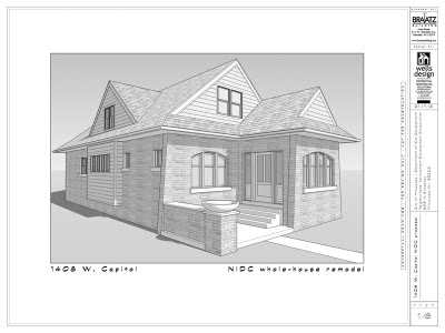
In the remodeling business, every new project brings its own unique design challenge. Solutions often have to be submitted with in very short window of time. For one project, the Milwaukee Neighborhood Improvement Development Corporation (NIDC) sent out an RFP to area contractors for a whole-house remodel on a foreclosed property on the city’s north side.
The deadline was a very tight two-and-a-half weeks from the issuing of the RFP to the submission of proposals. My time frame was made even shorter as it took several days for us to determine the feasibility of the project after meeting with the director of the program at the contractors’ open house.
Using SketchUp Pro provided us a way to meet the short deadlines and easily communicate our design ideas in detail in order to fulfill RFP requirements.
When we decided to give the project a go, the site was measured on a Tuesday. A rough ‘as-built’ model was created and preliminary plans were reviewed with my builder on Friday (three days later). By the following Tuesday, the “proposed” model was completed, and the next day the LayOut documentation shown below was finished—two days before deadline!
We were not allowed to present our design in person at the first stage of the review process, so we wanted to include as much information in our documentation as possible. Using LayOut’s ability to annotate the drawings, we made our case page by page.
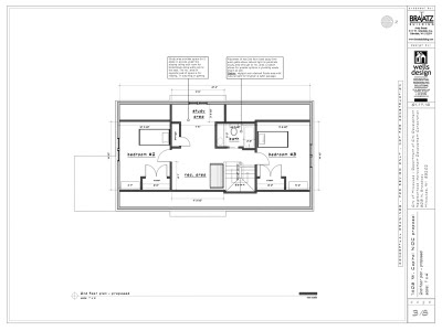
The floor plans show all of the descriptive text boxes explaining where we met the RFP requirements, as well as where we proposed changes to enhance the plan or simplify the construction.
The house itself was in good structural shape, but the interior was pretty rough, with the RFP acknowledging that the north end of the 1st floor and the entire 2nd floor would need to be gutted and refurbished. Using the Google 3D Warehouse to best effect, I was able to quickly populate the model with furniture and appliances to provide a human scale and clues as to how the home might be lived in.
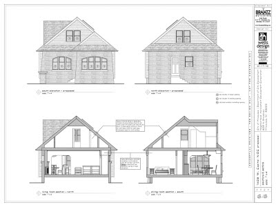
The exterior elevations and sections are created from the same model, continuing the annotation that would satisfy the RFP. The section cuts are “enhanced” with shaded geometry created in LayOut as the time frame didn’t allow for what I might normally more carefully model in SketchUp Pro.
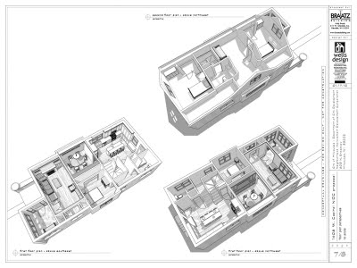
Finally, I added several perspective views to help the committee get a complete understanding of our proposal. One page shows an overhead view of the first and second floors with the ceilings removed to see the home from end to end, and then the final page shows an eye-level perspective from the key rooms on the first floor.
With SketchUp’s powerful modeling features, I was able to set all of these plan, elevation, section and perspective views using Scenes. With the model dynamically linked to LayOut, final tweaks and edits done in SketchUp were automatically updated in the LayOut document instead of having to rework entire drawings.
In this instance, the SketchUp Pro and LayOut features enabled me to create a comprehensive presentation under a very tight deadline that impressed both the committee and my builder.
Once our clients see it in 3D, they instantly get the concept. This allows for better feedback and generally leads to a quicker arrival of the final design solution. My favorite compliments come at the end of a project when a client says, “Iit looks just like the model!”
Posted by Chris Dizon, SketchUp Sales
Getting better sectional views in LayOut
Monday, April 18, 2011
The Problem
Here’s the scenario: You have a building model. You want to show a plan and a section in a LayOut document derived from your model. This involves using Section Cuts to make the slices. This sounds simple enough, but there are two factors that complicate matters significantly:
- You need to create a new style specifically for the scenes that show your Section Cuts. If you don’t, it’s really complicated to make sure unsightly Section Plane objects don’t show up in your LayOut document. The image below provides a visual explanation.
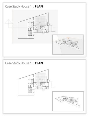 Top: If you're not careful, your Section Plane objects will show up in your LayOut document. Bottom: Things look much better when they don't.
- You need to use Scenes to let LayOut “see” each of your two Section Cuts (plan and section) independently. Without setting up scenes in your SketchUp model, there’s no way to assign specific a Section Cut to a viewport in LayOut. The blog post Connecting SketchUp Scenes to LayOut model viewports goes into more detail about this.
The key to making this process work is to create a custom style specifically for sectional views of your model. Here’s how:
Step 1
Choose Window>Styles to open the Styles Manager.
Step 2
Click the Create New Style button (see below).
Give your style a meaningful name; I suggest something like “Sections”. Press Enter on your keyboard to make sure it sticks.
Step 4
Use the settings in the Edit tab to make your model look exactly the way you want it to.
Step 5
IMPORTANT: Under “Modeling Settings”, make sure the Section Planes checkbox is deselected.
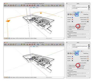 Deselecting the Section Planes checkbox in the Modeling Settings section of the Edit tab is the key to making sure your Section Planes are invisible.
Step 6
Click the Style thumbnail image to update your style with the changes you’ve made since you created it in Step 2.
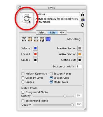 Click a style's thumbnail image to update it. This saves the settings you've changed since you started editing it.
Now that you have a custom style just for sectional views, you can apply that style to all the scenes that show Section Cuts. In my case, I created a new scene for each Section Cut. They’re called “Plan” and “Section”, appropriately enough.
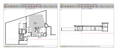 The "Plan" and "Section" scenes in my SketchUp model are set up to show different active Section Cuts. The style "Sections" is applied to both.
To make sure that the Sections style is applied to each scene, do this:
1) Activate one of the Section Cut scenes by clicking its Scene Tab.
2) Apply the Sections style by choosing it from the Select Tab in the Styles Manager.
3) Right-click the current Scene Tab and choose Update Scene.
4) Repeat Steps 1 to 3 for each of your other Section Cut scenes.
5) Save your SketchUp file.
With the right style applied to your sectional scenes, you’re ready to assign those scenes to different viewports in LayOut. Again, I covered the nuts and bolts of this process in this blog post from last year.
Another thing you should know
Every time you add a new Section Cut, all of the existing Section Plane objects in your model become visible. The custom style you created doesn’t change, though; as long as that style is applied to your scenes, and those scenes are assigned to your viewports in LayOut, everything should be fine. If (after adding a new Section Cut) you want to hide all of your Section Plane objects, all you have to do is choose View>Section Planes from the menu bar. Voilà!
Extra Bonus: This blog post from last year provides some suggestions for ways to poché (fill in) your Section Cuts.
Update: A previous edition of this blog post included some (bad) advice about waiting until you get to LayOut to assign orthographic views. On the advice of an expert, I've taken that bit out. Apologies for the confusion.
Posted by Aidan Chopra, SketchUp Evangelist
Featured Geo-modeler: Mano Papanikolaou
Wednesday, April 13, 2011
It was four years ago when I discovered Google Earth and the few (back then) 3D models. I started modeling about two years ago because I realized that nobody in my country is modeling well enough and I wanted to try my skills. I never expected that I could have good critiques from the best modelers and that made me continue.
I uploaded my first model on August 11, 2009 and it included some 3D plants from the 3D Warehouse, like roses, palms and a tree. That was the reason why it was not accepted into Google Earth. I didn't mind because I thought that it was an unimportant and small model and I preferred it with the 3D plants, rather than with with the "flat-crossed-png" ones! So, I went on to make more important buildings and there begins my 3D Warehouse story! Agia Sofia in my birth city, Thessaloniki, was my first accepted model!
As the first good comments came, I started to realize that I may make nice models! Every new model I did brought me more good comments (and commenters) and I started to become known to the community.
From me you will see mostly historical structures, always properly located and painted with the original photo textures i make myself. Simplified for Google Earth, but not losing the important details! I keep trying hard in every model to keep this "golden section". I have a lot of patience to work hard and long if necessary for things I like. I "fall in love" with Google Earth at the first sight! When I realized what you guys are giving to us, I was very enthusiastic! I spend hours exploring the whole planet.
It's difficult to name one favourite model; it's like if I asked you which child of yours is your favourite! But in this model (below), I like the atmosphere and its compact architecture. Also, I like the simplicity and the variety of the details.
I just want to see good models of the most important buildings of my city and country and I want to make more people here to model in the right way. I also want to show the people that we have beautiful buildings here and that there is somebody from Greece who really likes to model for Google Earth. I'm not the only one who makes models, but I think that the opportunity to build in Google Earth is one of the best things an Internet user can do.
Posted by Greg Wirt, SketchUp Team
Sketchup Pro Case Study: Fat Pencil Studio
Monday, April 11, 2011
The company name “Fat Pencil” refers to the traditional drawing instrument used by architects during the early stages of conceptual design—when it’s important to get ideas on paper quickly, and avoid getting bogged down by details. Google SketchUp Pro provides a digital equivalent of this practice, and it’s been an essential tool for us since Fat Pencil Studio was founded in 2004.
Fat Pencil Studio creates technical graphics for legal, transportation, and construction professionals. Some examples are courtroom exhibits, infrastructure visualization and site logistics diagrams. Our staff have engineering and architecture backgrounds. We use this experience to develop compelling visual presentations for complex projects.
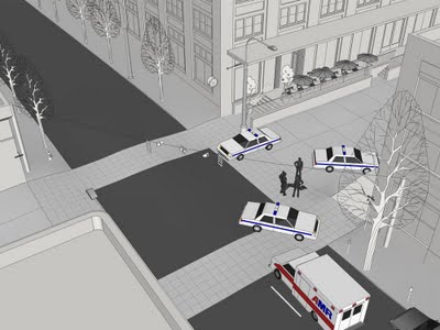 This trial exhibit is designed to allow witnesses to identify their vantage point in a birds-eye view, and then zoom to a street-level perspective using the Position Camera tool.
Last year, we helped the City of Seattle visualize the reconfigured Broadway and Jackson Street intersection along the proposed alignment for the First Hill Streetcar extension. URS (the prime contractor for the project) had already developed 2D design drawings in AutoCAD. They needed 3D perspectives for public stakeholder meetings and regulatory filings. Once the model was created, Alta Planning (another member of the design team) was able to use it as a design tool. Each intersection could now be seen from multiple perspectives: driving, cycling, and walking. This allowed Alta to identify and address safety issues related to a two-way Cycle Track proposed for the reconfigured street.
The buildings in this area of Seattle are already in Google Earth’s 3D Buildings layer, so we initially considered importing street features into Google Earth to create a presentation. However, the difficulty of matching terrain over such a large area forced us to scrap this plan. SketchUp Pro offers more flexibility for presenting the details that matter most in this project; namely, the new street configuration. After cleaning up the AutoCAD drawings, we draped the linework over imported terrain and then added 3D features. We used several plugins to help reduce modeling time: Projections V2 helped with the curbs. Drop and RepeatCopy helped us place trees, cars, bikes and people. We also had some help from the 3D Warehouse, including an excellent streetcar model by JediCharles.
The streetcar project also gave us an opportunity to collaborate with another firm. IBI Group of Portland was responsible for station design and also modeling the southern half of the 2.5 mile streetcar alignment. Their half of the model was created in SketchUp on Windows, using terrain data from a street survey. Our half was modeled with SketchUp on a Mac, using terrain data from Google’s servers. The terrain matched almost perfectly at the seam, with only minor “smooving” needed. Using the combined model, we were able to generate dozens of still image views and several flyover animations.
Currently, we are working on a project to present options for safety improvements in a few sections of Portland’s extensive bikeway system. In this case we did not have detailed CAD drawings as a starting point; this gave us an opportunity to try a new approach for modeling street markings. Using high-resolution satellite images as a reference, we traced a single line along the center of existing markings. The PathCopy script allows us to “paint” the street markings as a series of components. Spacing can be configured for dashed lines, or set to zero for solid lines. This strategy speeds up modeling and allows global changes to the color and style of markings.
Posted by Chris Cronin, SketchUp Pro Sales
Using SketchUp models in 3DVIA Scenes
Thursday, April 7, 2011
The first fruit of this collaboration is a video that Cliff made specifically for SketchUp modelers. It shows how to use 3DVIA Scenes to explore an imported SketchUp model by walking around inside it. The killer app (in my opinion) is a feature that lets multiple people explore the same model simultaneously as avatars. SketchUp’s Walk Tool offers a similar, first-person experience, but having the model online and accessible to anyone with a web connection is enormously powerful.
Two things: Cliff tells me that Mac compatibility for 3DVIA Scenes is on its way. Also, the clever folks over at Dassault have built an iOS app (for Apple mobile devices) that lets you view and interact with models you’ve uploaded to 3DVIA.com. Since COLLADA (.dae) is one of the formats they accept, you can use these apps to view SketchUp models, too. 3D everywhere!
Posted by Aidan Chopra, SketchUp Evangelist
Statewide SketchUp Pro for K-12 schools
Wednesday, April 6, 2011
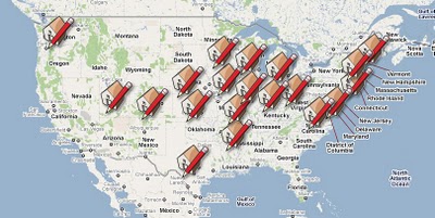
Though lots of schools use the free version of SketchUp, we’d prefer that they get SketchUp Pro 8—there’s lots in the professional version that students and educators can use. To that end, we offer a special, no-cost license grant to U.S. states (and Canadian provinces) that want to install SketchUp Pro in every single one of their K-12 schools. There are currently 20 states in the program; collectively, they represent over 250,000 seats. Visit the SketchUp Pro Statewide K-12 Licence Grant website for information about signing up. Spreading the SketchUp love makes us happy. We invite your state (or provincial) technology director to apply.
We’re in the process of exploring a means of rolling out this program internationally, too. If you represent a state, province or other territory in a country other than the U.S. or Canada, and you’re interested in implementing something similar, please drop us a line at sketchupforeducation@google.com.
Posted by Allyson McDuffie, SketchUp for Education Program Manager
SketchUp 8: Now in a dozen languages
Tuesday, April 5, 2011
 Back in November, we promised SketchUp 8 in three more languages. Well, today’s the day. All of us here at SketchUp HQ are pleased to let you know that Russian, Dutch and Simplified Chinese are ready and waiting to be downloaded from our website. They join French, Spanish, Italian, German, Japanese, Korean, Brazilian Portuguese, Traditional Chinese and English (UK and US) for a total of twelve languages.
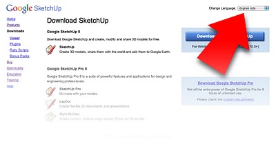 To see the SketchUp website in another language, use the Change Language drop-down menu in the upper-right corner of any page.
Posted by Aidan Chopra, SketchUp Evangelist
Pausing the Real-World Sightings experiment
Sunday, April 3, 2011
On Friday, we prematurely launched a feature called “Real-World Sightings,” showcasing fantastical creatures our users have spotted around the world. We’ve rolled back the test, but wanted to share an explanation in case you came across any surprising images in Google Earth and Google Maps.
We’re always working to provide an up-to-date, accurate reflection of the real world through our products. On Friday, we learned of many additional sightings through reports submitted by our users, and we have decided to pause the beta until we can provide more comprehensive coverage of these mystical creatures.
For those of you who are curious about this brief experiment, check out the slideshow below to see all of the images and the locations included in the test.
We’d also like to take a moment to thank the Google SketchUp users who helped us create the 3D models for this experiment: Aerilius, Athinaios, Bdhy, BerylDrue, Fingerz, Jan Wesbuer, KangaroOz, NESUA, and Zoungy.
Posted by Scott Shawcroft, Software Engineer
Real-World Sightings, Now in Google Earth and Maps
Friday, April 1, 2011
He wasn’t scared or hostile. In fact, he seemed quite amused as a few brave drivers navigated around his over-sized legs to successfully cross the bridge. Soon everyone’s fear and alarm gave way to wonder and surprise. As I made the journey under the giant crustacean's torso, I was reminded how much bigger the world is than we often realize. I made it to Nessie’s place in Boston safely and got to thinking: the world must be full of magical stories like this. My friends at Google agreed, and so we asked users from around the world to share stories of the strange and delightful things they’ve seen. We were surprised at how many reports we received, so today we’re adding a new feature to Google Maps and Earth: Real-World Sightings. People have witnessed fantastical creatures in every corner of the globe, and in our effort to mirror the real world as completely as possible, we have decided to start including these eyewitness reports on the map. So if you happen to run into a dragon or alien today in Google Earth (make sure you have 3D Buildings turned on) or Maps, don’t be alarmed. Instead, we encourage you take a few minutes to look for other creatures that have been reported in places all across the world. We’ll tweet some tips to help you get started finding these images on our Twitter handle @GoogleMaps, so follow along throughout the day to spot some fun things you may have thought only existed in legends and fairy tales! Posted by Dave Barth, Product Manager


