SketchUp Pro Training Schedule: Aug/Sept 2011
Saturday, July 30, 2011
View in a larger map
Updated Acceptance Criteria for 3D buildings in Google Earth
Friday, July 29, 2011
Our new Acceptance Criteria have been completely rewritten with the goal of making them clearer and easier to follow. Issues relating to photo textures, permanence of structures, splitting, and entourage have proven to be the most common areas of confusion in the past:
Photo Textures
 Our new minimum requirement for photo textures is more lenient than it’s been in the past. Photo textures are only required on upward facing surfaces of the model and on the main facade. We encourage you to photo texture the entire model, but we also understand that it may be difficult to get accurate imagery on every side of some buildings. Any remaining, non-photo-textured faces in your model should be painted with realistic-looking textures that match the color and look of the building in real life.
Permanent Structures
 Beginning today, only permanent structures will be accepted. As we constantly refresh our satellite imagery, temporarily-positioned entities like vehicles and people don’t belong in Google Earth’s 3D Buildings layer.
Model Splitting

From now on, all submitted models should contain only one structure each. Each structure should be uploaded as a separate model file. This includes properties that have multiple buildings on them such as a house and a shed or garage. If buildings are all connected in a city block, they should be split into separate models based on building type, function or address. When our review team is assessing connected block models for splitting issues, we will look at the facade and roof textures to see if there are changes in material that signify where a split should have occurred.
Entourage

In addition to splitting buildings, we are now requiring all models of trees and other permanent entourage (such as signs, light posts and benches) to be uploaded separately from the buildings with which they may be associated. This ensures that when another building is uploaded in the same location, we are only judging the quality of the new building model versus the original. It’s a shame to have to remove good tree models just because they’re attached to a building model when a better building model is submitted that doesn’t contain trees.
Also, multiple, related trees and other entourage objects can be grouped into a single model as long as they are located in a relatively concentrated area. This means a single model can contain all the trees for a block or a park, but it shouldn’t contain all the trees for multiple blocks or an entire city. Remember that only permanent entourage is acceptable—cars and pedestrians move around, and thus don’t belong in Google Earth’s 3D Buildings layer.
Other improvements
One other big improvement we’ve made is the addition of tips and suggestions to each of the thirteen individual Acceptance Criteria. If a model you submit isn’t accepted, you’ll receive an email notification (opt into these emails via your preferences) that includes a direct link to concrete information about how you can improve it before you re-submit.
What about models that have already been accepted?
To help make this transition easier, we won’t be going through all the models we’ve already accepted in order to remove ones that fail to meet the new Acceptance Criteria. If your model has already been accepted, it will stay in the 3D Buildings layer until and unless it is sent through the evaluation process again. There are four actions which can cause a model to re-enter this process:
- You make an edit to your model and re-upload it to the 3D Warehouse, replacing the previous version.
- Someone else submits a model in the same location as your model.
- Periodic terrain and aerial imagery updates cause your model to go through our automated alignment process.
- Someone clicks the “Report a problem” link for your model in Google Earth.
It’s still a bit of a subjective process
Keep in mind that judging 3D models is still a difficult task and is prone to subjectivity. All submitted models are reviewed by real human beings who take time to ensure that they meet our standards. Because human beings sometimes make mistakes, we have a way for you to appeal negative judgements. If, after reviewing the Acceptance Criteria, you feel we’ve made the wrong decision, use the “Tell us why we’re wrong” link (at the bottom of the model’s 3D Warehouse page) to ask us to take another look. You’re encouraged to include links to photos of the actual building or other online resources to will help us to understand your point of view.
We know how much time and love goes into making beautiful 3D models for Google Earth, and we greatly appreciate all the effort you put into your work. Here’s hoping that the changes we’ve made will make for a smoother, more enjoyable geo-modeling process for everyone.
Posted by Jordan Van Wyk, 3D Modeling Specialist
Formatting text in LayOut on a Mac
Wednesday, July 27, 2011
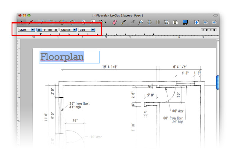
Selecting a piece of text (when your ruler is visible) reveals drop-down menus for Paragraph Style, Alignment and Spacing, as well as preset settings for bulleted and numbered lists. Windows users can access list formatting controls in the Text Style dialog box.
Compared to the last tip I wrote, this one was quick, eh?
Posted by Aidan Chopra, SketchUp Evangelist
Welcome aboard to our newest K-12 grant recipients
Monday, July 25, 2011
If you're a K-12 educator, you can check out details on our Google SketchUp Pro K-12 License Grant program site. It includes links to valuable training resources, technical support information, a group forum, case studies, and a map of states, provinces and counties which have already enrolled. If your locality isn't one of them, ask your state technology director (or international equivalent) to apply. License grant recipients don't pay a cent for SketchUp Pro.
View Google SketchUp Pro K-12 Statewide License Grants in a larger map
Posted by Allyson McDuffie, SketchUp for Education Program Manager
Making doors look right in different ortho views
Saturday, July 16, 2011
- In plan, doors are generally shown in the open position.
- In elevation, doors appear closed.
- When cut through in section, doors disappear altogether.
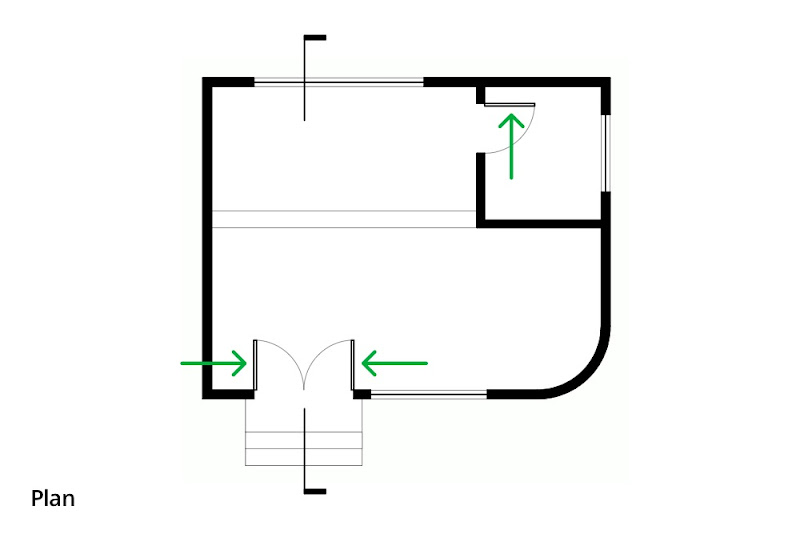 In plan, doors appear open to show their swing. In the above image, the swing arcs, section cut graphics and arrows were added in LayOut.
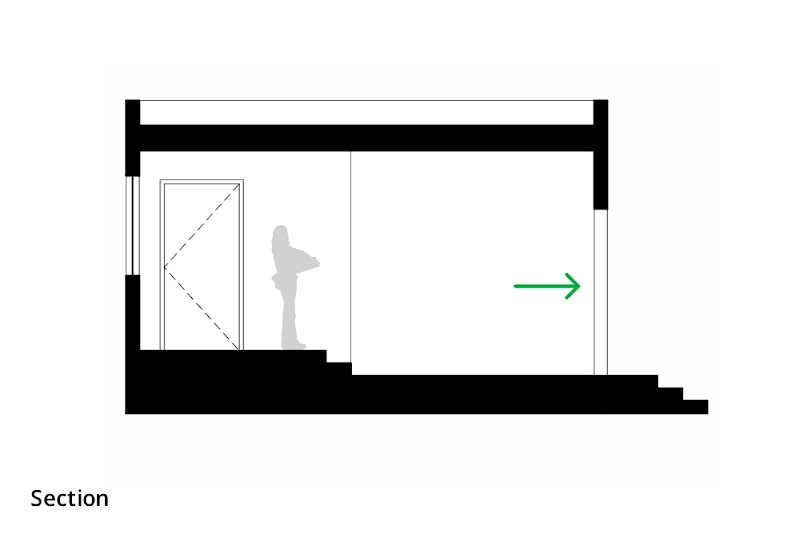 In sectional views, doors which are cut through don't appear at all. All that is visible of the doorway in the above section is the edges of the wall beyond the cut. Doors which appear in elevation (like the one on the left) are shown closed.
If I’m modeling a building and I leave the doors open, they’ll look correct in plan but not in other views. If I close them, the plans will look wrong. Clearly, I need two sets of doors—one open, one closed—and I need to manage which set is visible in each view. Layers, Scenes and nested components to the rescue!
The idea here is to create a door component that includes two sub-components: one that’s an open door, and one that’s a closed door. Mine looks something like this:
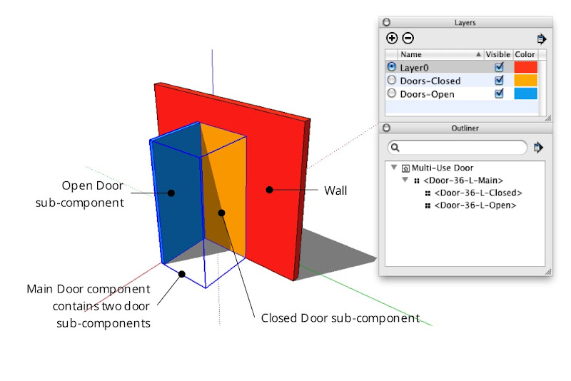 A door component which includes both open and closed door sub-components, each on its own layer. In the image above, "Color By Layer" is turned on to better illustrate the setup. The Outliner dialog box shows the nesting relationship of the three door components.
Creating a combination door component
Start by modeling both doors and turning them into a set of nested components:
Step 1
Create the hole into which you want to insert a door.
Step 2
Model a door in the closed position. Keep it simple; a rectangle is fine for now.
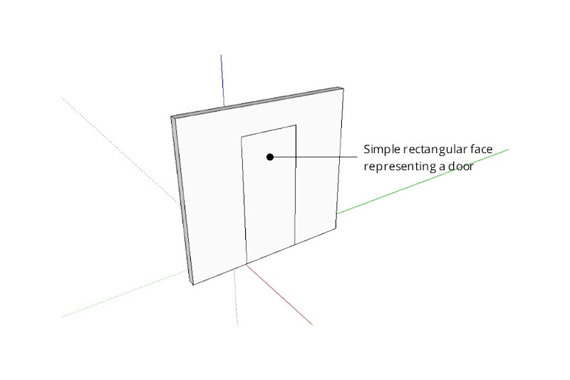 Fill the doorway opening with a simple face. Make it flush with the side of the wall into which the door will open.
Step 3
Select only the door geometry and turn it into a component. Give it a meaningful name that describes its size, orientation and position like “Door-36-L-Closed”.
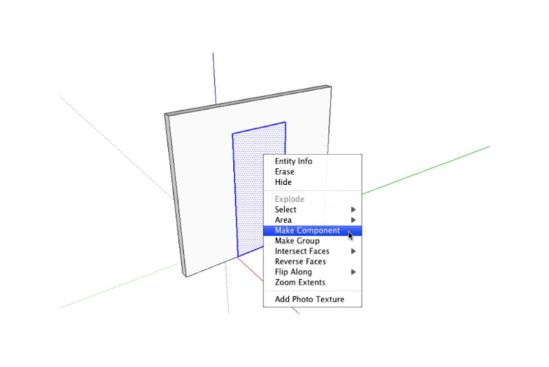 Turn your simple door into a component by selecting its geometry and right-clicking to open a context menu.
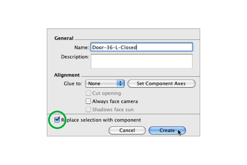 Give your door component a meaningful name; "36" indicates the width and "L" indicates the left-hand hinge position. Make sure the "Replace selection with component" checkbox is selected before you click Create.
Step 4
If you like, add detail (like a thickness) to the door you just modeled.
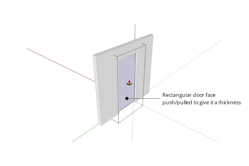 Extruding the single face into a 3D object will make it read better in plan. Resist the temptation to add doorknobs, detailed woodwork or anything else that isn't in keeping with your model's current level of detail.
Step 5
Model the same door in the open position. Be sure not to duplicate the component instance you made in the previous step — the whole point of this exercise is to have two, separate components.
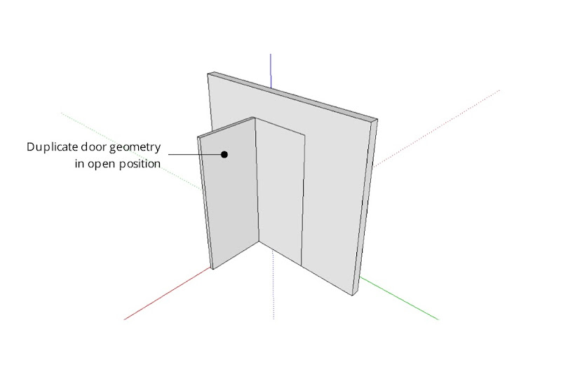 Model the same door again, this time in the open position. For accuracy, line up the edges where the hinges would be on a real door.
Step 6
Turn the open door into a new component. Call it something like “Door-36-L-Open”.
Step 7
Select the open and closed door components and make a new component that includes both. A good name for this component might be “Door-36-L-Main”.
Using Layers to control component visibility
The next step is to put each sub-component on a separate layer:
Step 1
Choose Window>Layers to open the Layers Manager.
Step 2
Create a new layer called “Doors-Open”.
Step 3
Create another layer called “Doors-Closed”.
Step 4
Choose Window>Entity Info to open the Entity Info dialog box.
Step 5
Start editing your Main door component (the one that includes both sub-components) by double-clicking it with the Select tool.
Step 6
Select the closed door sub-component and move it to the “Doors-Closed” layer using the Layer drop-down menu in the Entity Info dialog box.
Step 7
Select the open door component and move it to the “Doors-Open” layer.
Step 8
Click elsewhere on your screen to stop editing the Main door component.
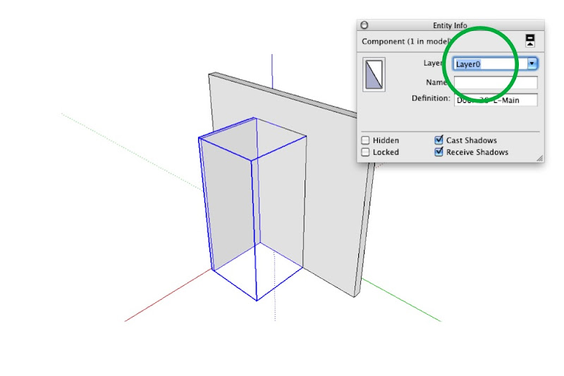 Make sure the Main Door component (which includes both sub-components) is on LayerO. If you're really advanced, I suppose you could even have a layer dedicated to these "combo" door components. Tread lightly, though—layers can be tricky to work with.
Setting up Scenes to control layer visibility
After you’ve placed doors wherever you need them in your model, you can control which set is visible by creating (or updating) scenes that show only one “Doors” layer at a time. It’s pretty straightforward, really:
Step 1
Activate the scene that corresponds to a plan view of your model. If you don’t have one yet, just create a new scene called “Plan” and worry about getting the camera position in order later.
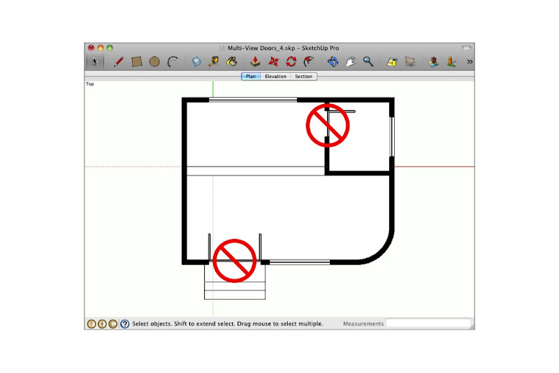 Right now, both the Doors Closed and Doors Open layers are visible. We only want the open doors to appear in the above plan.
Step 2
In the Layers Manager, hide the “Doors Closed” layer.
Step 3
Right-click the “Plan” scene tab and choose Update.
Step 4
Repeat the above three steps for any other planimetric scenes in your model.
Step 5
Go through the above process again for any scenes where doors should appear closed.
Dealing with doorways in section
What about doors that are cut through by section cuts? They shouldn’t appear at all. The solution here is simple: Just hide the offending door components and update your scene.
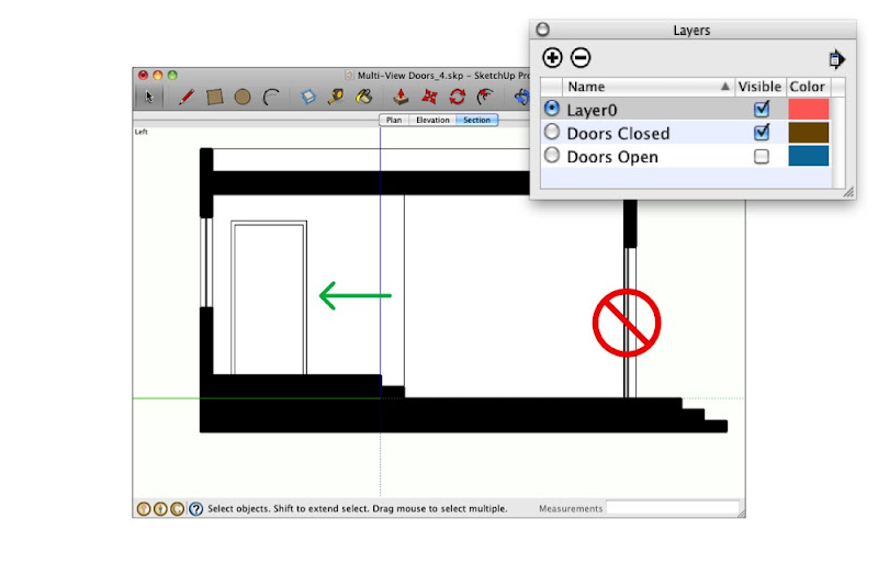 Doors which are cut through in sectional views shouldn't appear at all. Those which appear in elevation (like the one on the left) should appear closed.
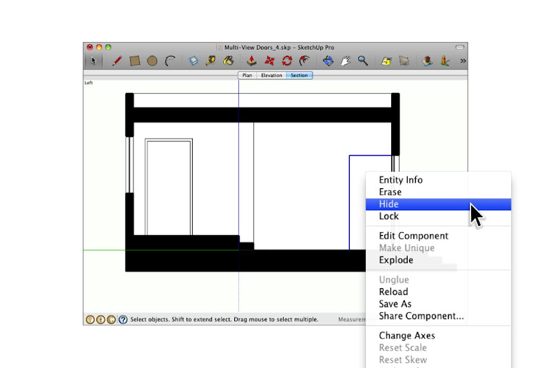
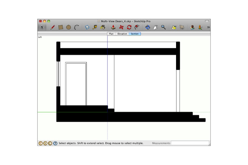 Simply hiding door components you don't want to see (then updating the corresponding scene) is the easiest way to deal with this conundrum.
One more thing: I've added the above example model to the 3D Warehouse so you can download it and do some of your own experimenting. You can find it here (click the 3D Warehouse logo to go to the model in the 3DWH):
Posted by Aidan Chopra, SketchUp Evangelist
Sharks, rays and SketchUp at the New England Aquarium
Thursday, July 14, 2011
SketchUp Pro has been a big help to us in the New England Aquarium Design Department. The Aquarium was founded in 1969 and attracts over 1.3 million visitors a year to our waterfront location. Recently the Aquarium’s capital improvement plan called for a complete renovation of our changing exhibits space, and we decided to part with the Aquarium’s traditional design aesthetic and embark on a new path.
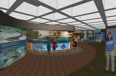
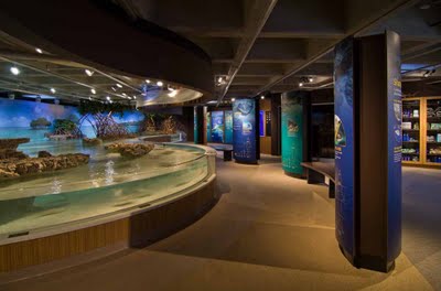
The newly completed exhibit we designed in SketchUp Pro is called The Trust Family Foundation Shark and Ray Touch Tank. It features sharks and rays in a mangrove-themed tank surrounded by shallow edges and viewing windows, allowing visitors to experience a close encounter with these animals.
The exhibit presents these incredible species in a way that highlights their importance in a healthy ocean ecosystem. It also emphasizes the value of conserving essential coastal habitats, such as mangroves and lagoons. During evening hours the new space is also used as an event venue for private functions.
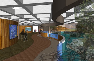
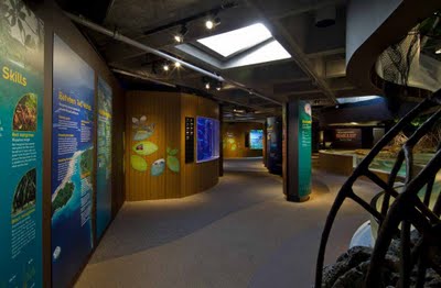 View from the entrance of the shark and ray touch tank. On top is our design phase
rendering; below is an opening day photograph.
The Aquarium provides unique challenges for designers. We have a variety of internal clients with different needs, and we need a modeling program that works quickly and accurately to convey our ideas. SketchUp’s quick modeling capabilities provided me the extra time needed to explore multiple design options on this project.
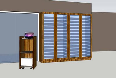
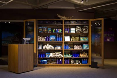
SketchUp also enabled our design team to give everyone at the Aquarium a sense of the new exhibit’s aesthetics quickly and easily. In addition to quickly creating renderings, we imported actual material samples into our models. This allowed staff and visitors to get a sense of scale and of how significant the interaction with animals would be.
 View from inside the exhibit towards the Lagoon and Cassiopeia tanks. Above is
our design phase rendering; below is an opening day photograph.
Our traditional design aesthetic for the Main Building is to make the visitor feel like they are submerged underwater, looking through portals to all the fish. The new exhibit needed to be airy and bright, allowing visitors to feel that they are no longer submerged but at the beach level interacting with the animals. To achieve this we revealed the once covered up skylights and installed a significant amount of energy efficient lighting. With natural and artificial lighting we simulated the feeling of wading around a beach touching sharks and rays.
This “no surprises” methodology allowed us to receive design input from different departments quickly. Given our very tight schedule and lack of resources, it proved to be most helpful. We’re excited to continue to use SketchUp Pro on future projects and renovations at the New England Aquarium.
Posted by Chris Cronin, SketchUp Sales Team
Expanded 3D Buildings coverage
Thursday, July 7, 2011
- Cologne, Germany
- The Hague, Netherlands
- Berkeley, California
See the new buildings for yourself using Google Earth’s “3D Buildings” or by using Google Maps with Earth View.
Happy touring!
Posted by Catherine Moats, 3D Data Specialist


