SITEOPS: Conceptual design for land development

Wednesday, November 30, 2011

Back in architecture school, I once had to lay out a parking lot for a building I was designing. What a terrible, terrible exercise in nitpicky details and perpetual re-arrangement. The solution I came up with accommodated all of four Smart cars and a unicycle. Awful. If only I’d had access to a tool like SITEOPS from BLUERIDGE Analytics.

SITEOPS is conceptual land development software for folks like architects, civil engineers, landscape architects and land developers. After you’ve brought in a site, you can combine building footprints with critical elements like parking, islands and driveways. These elements are parametric, meaning that they re-draw themselves on the fly as you change aspects of your conceptual design. SITEOPS even provides budget tools for estimating the cost of a project.

Want to see what a parking layout might look like if your building were on the other side of the site? As you slide it over, the parking lot automatically reconfigures to maintain the proper number of spaces. Too cool. This short video shows SITEOPS it in action:


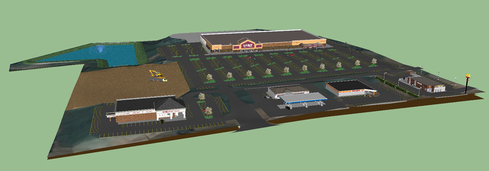
Realizing that lots of their users are also SketchUp devotees, the good people at BLUERIDGE have added an Export to SketchUp button to their product. It lets you figure out the complicated stuff in SITEOPS, then visualize your project in SketchUp. It’s available to SITEOPS customers who have also purchased the Grading and Piping Module. These pictures tell the story better than words can:
This is a view of a 2D site layout in SITEOPS.

A 3D image of the same site in SITEOPS' Grading and Piping Module.

The site after it's been exported to SketchUp. The model includes all of the 3D topographical information from SITEOPS.

Here’s a video that features a couple of SketchUp users talking about their impressions of SITEOPS’ new SketchUp integration:


Update: The folks at BLUERIDGE Analytics are offering a free webinar about using SITEOPS with SketchUp Pro. It's scheduled for 2:00 PM EST on Wednesday, January 11th, 2012. Sign up if you're interested—the webinar also carries 1 PDH or 1 LU.

Getting a better view of small interior spaces

Tuesday, November 22, 2011

When you’re modeling a small room, it can be a pain to see what’s inside. The problem is that the walls and ceiling get in the way. One solution is to lop off the ceiling and work in a top view, dollhouse-style. Other folks set up scenes from the interior corners and adjust their Field of View to something super-wide like 90 degrees.

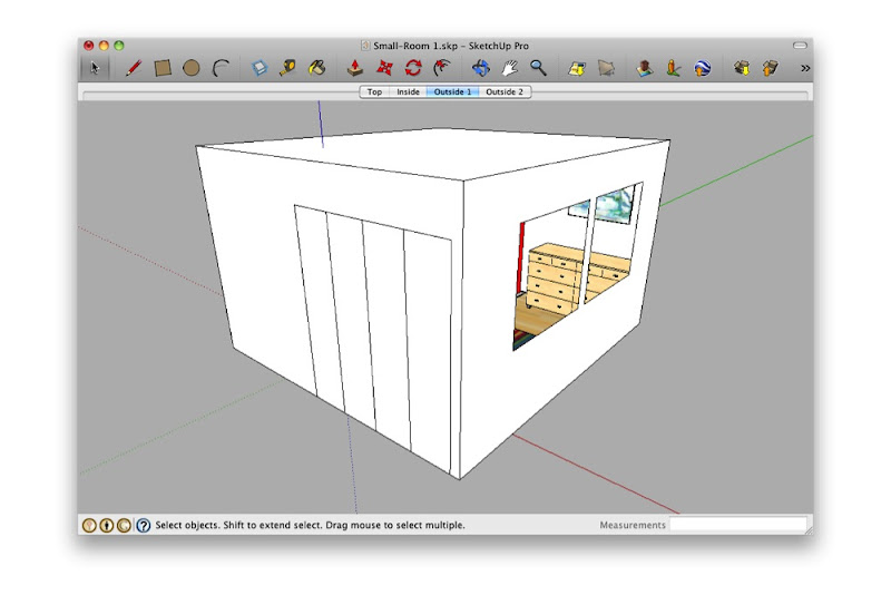
Looking at a small interior space from the outside isn't very rewarding.

Deleting the ceiling and switching to a top view is useful, but fiddly.

Standing in the corner and making your Field of View really wide is just weird. What are you—a housefly?

Both of the above techniques work—to a point. Personally, I think it’s like trying to read a book through a keyhole. By far my favorite method for working on small interiors is to make use of SketchUp’s ability to have faces with different materials on each side:

The face separating Susan and Sang is yellow on one side and green on the other.


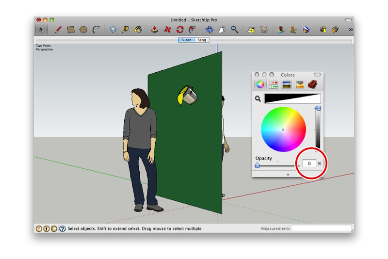
Creating a completely transparent material and painting the green side makes it see-through.

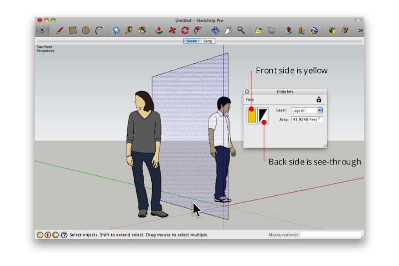
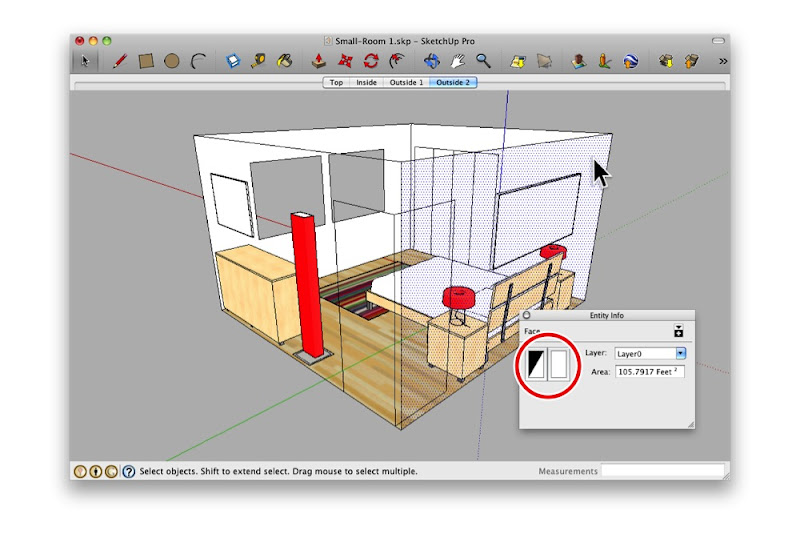
The Entity Info dialog box shows that the selected face is yellow on the front and see-through on the back.

By painting the outward-facing surfaces with a see-through material—one whose opacity is set to 0%—I can see in from the outside. Super useful, super simple.

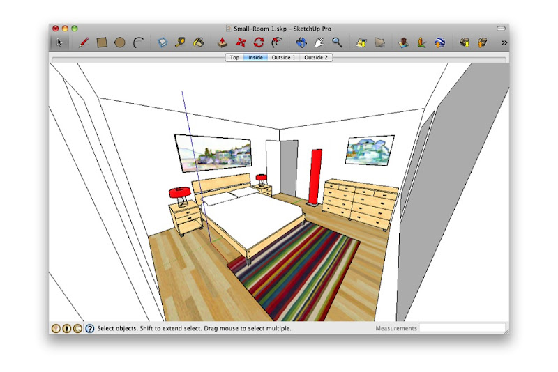
Here, I painted all of the outward-facing surfaces with a transparent material. Notice that the interior surfaces still look opaque?

Orbiting around my model, I can see through all of the walls. I can even see through the floor.

Announcing the 2012 Google Model Your Town Competition

Thursday, November 10, 2011

Following the success of last year’s Google Model Your Town competition, today we're launching the second Google Model Your Town Competition. Model Your Town is about geo-modeling – making photo-textured models of real-life buildings that appear in Google Earth. The Model Your Town Competition is also a chance to celebrate your town by adding it to the 3D map. Of course, the USD$25,000 for a local school/district is a nice incentive too.

Barranco, Lima, Peru

The Model Your Town Competition is open to just about everyone, just about everywhere in the world. Form a team, model buildings (using SketchUp or Building Maker) and upload them by the end of February 2012.


You can model as many structures as you like – which types of buildings you choose to include is entirely up to you. The important thing is that your choices say something about the character and history of your town.

If your town wins, a bunch of us from the SketchUp team will visit, throw you a dinner party and do our best to make you feel like the local hero that you truly are. Check out the competition website for details, and start rounding up teammates!

Here's some inspiration by way of the 2010 winner, Jorge De Albertis, from Lima, Peru (just to get your creative juices flowing):


New to geo-modeling? Learn more at Your World in 3D, then get started modeling your town!

Posted by Allyson McDuffie, Google Geo team

Introducing Maxwell for Google SketchUp

Wednesday, November 9, 2011

Among rendering die-hards, the name “Maxwell” has long been synonymous with jaw-dropping realism. Maxwell Render’s makers have offered a SketchUp-to-Maxwell solution for a few years, but it required modelers to have access to Maxwell Render Suite—the full, standalone version. For SketchUppers on a budget (or who only need to make the occasional rendering), this wasn’t an ideal arrangement.

A delicious Maxwell render by Rune Skjøldberg.

To accommodate more people, the folks behind Maxwell have just released something they’re calling Maxwell for Google SketchUp. It’s a dedicated photo-renderer, based on the venerable Maxwell rendering engine, that operates entirely inside of SketchUp. Best of all, it has the Big Three qualities going for it:

  • Cross-platform. It works on both Windows and Mac systems.
  • For both free and Pro. It works on both SketchUp and SketchUp Pro.
  • Two entry points. There are free and licensed versions available.

As you can see in this straightforward feature matrix, the free version allows you to render in Draft mode and limits your resulting image to a resolution of 800 pixels. The Licensed version adds Production mode (faster rendering of complex lighting) and increases your maximum output resolution to 1920 pixels. At only $95/75€, the paid version is a bit of a bargain.

Another render by Rune Skjøldberg showcasing multiple light sources.

If you’re looking for all the bells and whistles and extra pixels that Render Suite offers, the “bridge” plugin for sending your SketchUp model to R.S is still available. So really, SketchUp modelers who want Maxwell’s delicious, unbiased results have three options. And they’re all good ones.

Posted by Aidan Chopra, SketchUp Evangelist

New Getting Started Videos for SketchUp

Thursday, November 3, 2011

Our Official Training Videos have been responsible for teaching literally millions of people to use SketchUp. Concepts of SketchUp, the first video in the old series, has been viewed over 7 million times. Collectively, people have spent something like 40 years watching that video. That’s a lot of popcorn.

As popular as they were, our old videos were getting a little long in the tooth; they showed SketchUp 6. We decided that they should be remade, so we locked Tyson in a closet with a computer and a pile of army rations. It worked—our new training videos are not only current, they’re gorgeous. With Tyson’s scripts and visuals (and Alex’s melodious narration), getting started with SketchUp has never been easier. Here they are, in order:


One more thing: We didn’t stop at the videos. We gave the whole SketchUpVideo YouTube Channel a facelift. With helpful navigation menus in the upper-left corner, a new masthead and a big, blue Download button right at the top, SketchUp’s home on the world’s biggest video sharing site is now a whole lot lovelier. Pop on over when you get a chance.


How do you make ideas real with SketchUp?

Wednesday, November 2, 2011

Every week, two million people use SketchUp to breathe life into their ideas. The resulting 3D models get made into houses and schools, movie sets and aquariums, bridges, robots, and furniture. The sum total of all this work represents a larger, yet untold story of how the SketchUp community is profoundly shaping the world around us.

Well, it’s time for all you unsung SketchUp heroes to stand up and take a bow, so today, we’re kicking off the Make Ideas Real project. The result of this initiative will be an innovative, online showcase that does justice to the impact SketchUp users are having on the physical world.

But we need your help to pull this off.

Make Ideas Real with SketchUp

Here’s how you can pitch in: Use this form to tell us your SketchUp story. Send us an image of a SketchUp model with an accompanying photograph that shows your completed project. Anything goes for subject matter; architecture, archeology, industrial design, construction, woodworking, personal fabrication, model railroading, mousetrap design — as long as SketchUp helped you make it, we want to see it. Professionals, semi-professionals and proud amateurs are all welcome.

Here are three examples of what we mean:

City Lights Residence, Steve Oles


SKPR Bot, John Bacus


Stand Up Desk, Dave Richards and George LaRue Downing

Over the next few months, we’ll curate the submissions we receive, and in 2012, we’ll launch a special showcase of SketchUp users who are reimagining the spaces we inhabit. Please share your story with us, so we can share it with the world.

Posted by Gopal Shah, SketchUp team