Improved Ruby API scripts
Tuesday, November 25, 2008
Got Style?
Monday, November 24, 2008
Style Builder lets you take hand-drawn lines (or any other lines you create) and apply them as edges in a SketchUp model. Now you can make your 3D models look like sketches, abstracting out the things you're not ready to discuss, and bringing forward the things you do. Styles you create in Style Builder are also totally unique; no one else will be able to make drawings that look like yours.
Check out this video to see how Style Builder works:
Posted by Bryce Stout, Product Manager
The Google 3D Warehouse in your language
Friday, November 21, 2008
Using Google's new translation service, we've added a new feature that detects if a model's description is written in something other than your preferred language. If so, it offers you a translate option. So even if you don't read Simplified Chinese, you can still read about this model. And if you're having trouble remembering your German, this model is still within reach.
Posted by Mark Limber, Product Manager
All about upgrades
Thursday, November 20, 2008
- Link to download Google SketchUp Pro 7 (if you haven't already)
- License information you need to authorize it
Here are some more things to keep in mind:
- The cost to upgrade each license is US$95, EU€64 or UK£51.
- Please have your current serial number, registered user and company name available when you visit the upgrade portion of our store.
- If you have any trouble upgrading, please visit our online help center for more detailed instructions.
- If you purchased a SketchUp Pro 6 license on or after October 1, 2008, the fee is waived as long as you upgrade before or on December 31, 2008.
- If you purchased a SketchUp Pro license through one of our authorized resellers, please contact that reseller directly for upgrade terms.
- If you've contacted us through the Help Center recently, we will try to respond as quickly as possible. Visit this forum post for troubleshooting suggestions.
The 3D Warehouse inside SketchUp
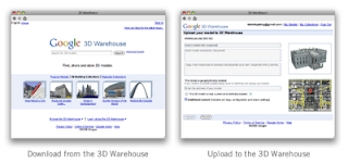
Now when you click the Get Models icon in SketchUp, you'll see a new, simplified homepage with a cleaner overview of 3D Warehouse content. You can sit back and watch the models roll by or get straight down to business by searching for what you need. Here's another hint: If you're new to the 3D Warehouse, the content under the Browse and Learn menus is also worth a closer look.
We've improved the model upload process, too. Clicking Share Model (back in SketchUp) provides you with a greatly simplified upload page. It also includes a preview of your model image and a map for geo-located models.

Posted by Matt Simpson, UX (User Experience) Designer
More about Dynamic Components
Tuesday, November 18, 2008
But now it is.
In SketchUp 7 (which we just released yesterday), Dynamic Components are 3D models that behave like the real-world objects they represent. They make using SketchUp faster and easier than ever, so you can spend less time modeling and more time designing. They're just "smart" versions of regular SketchUp components, so you can use them in any model you're working on.
Check out this video for a basic rundown on Dynamic Components (a picture's worth a thousand words, after all...)
You can use existing Dynamic Components in both (free and Pro) versions of SketchUp, but if you want to make your own, you'll need SketchUp Pro 7. Dynamic Components work by letting you attach attributes (pieces of extra information) to SketchUp groups and components. After that, you can add formulas to create relationships and control how they interact. It's a lot like working with spreadsheets, actually.
And if you're not sure, just download SketchUp Pro 7 to play around with them. You'll find plenty of resources to help you get started: videos, FAQ, self-paced tutorials, working examples and of course, written documentation.
Posted by Peter Saal, Product Manager
Sometimes you need more than a model
1) included with SketchUp Pro 7
2) out of Beta
3) available today!
What's LayOut? Well, it's like this...
Say you've got kids (like I do) and they've snookered you into working on a design for the new playground at their elementary school. "No problem!" you say, and you whip up a a great design and model it like a pro in SketchUp. Project done, right? Well... now the Principal would like to see the design, as would the president of the PTO. And then the fund raising committee would like a nice picture to display at the bake sale. The well-meaning contractor needs to know what it looks like, and wants to get the landscaping started today. They all think your model is great, and they all want a copy of it. Right now.
What you need is LayOut: the easy-to-use documentation tool for SketchUp models. With LayOut, you drop your SketchUp model into a pre-built document template (with professional titleblock and everything), generate a quick set of scaled drawings for the contractor, and a nice presentation perspective for the bake sale. And when you're done, you email a PDF file to everyone on the project and give the Principal a polished slide presentation in his office from your laptop.
Funds are raised, the playground is built, the kids are heroes with their friends and everybody's happy! In fact, everything is going great now, except the kids (inspired by your success with the playground) would now like you to get them a puppy. You're on your own with that one...
Posted by John Bacus, Product Manager
Drum roll please: Introducing SketchUp 7
Monday, November 17, 2008

Two years in the making and the result of many, many people's hard work, Google SketchUp 7 has arrived. You are cordially invited to visit our website to download a copy for yourself. We can't wait to see what you think.
First things first: We made a video to tell you about the new stuff in 7. I recommend watching it twice: Once to learn about what's new, and once more to see what programmers do when they're told to "just stand there" in front of a video camera. Feel free to microwave yourself some popcorn before you click "play".
You can find an exhaustive list of what's new in 7 on our (aptly named) What's New in SketchUp 7 page, so I won't bother repeating everything here. Suffice it to say, there's a lot, and we couldn't be prouder.
For SketchUp 7, we decided to focus on three main areas:
- Making SketchUp easier for new modelers to learn
- Adding "power tools" for SketchUp Pro gurus who dream in faces and edges
- Clearing the way for even more model sharing and collaboration
Enough blathering from me – the best way to learn about 7 is to download and try it out for yourself. But before you go, three things:
- Installing SketchUp 7 on your computer won't affect SketchUp 6; you'll have access to both versions for as long as you like.
- If you have a license for SketchUp Pro 6 and you'd like to upgrade to Pro 7, have a look at our store to find out how.
- Keep an eye on this blog for plenty of in-depth follow-up posts about the features and improvements in SketchUp 7. We'll be adding new stuff every day this week.
Posted by Aidan Chopra (on behalf of the SketchUp, LayOut and 3D Warehouse teams)
When in Rome...Teach!
Friday, November 14, 2008
While we hope that teachers are already pretty excited to incorporate Ancient Rome 3D into their lessons, we wanted to go a step further and issue an open challenge to educators to harness the power of this new tool in the classroom. Today, we're proud to announce the launch of the inaugural Google lesson plan contest for K-12 educators in the US, the Ancient Rome in 3D Curriculum Competition. Whether you teach art history to high school students or geometry to fifth graders, the new visual tool can spice up lessons old and new. From a comparative architectural study using the ancient 3D models and modern Street View imagery to a new LitTrip of Virgil's Aeneid, the only limit is your imagination!

From Caesar to Augustus, the Roman Forum to the Arch of Constantine, it's time to get those creative juices flowing. Register and upload your original curriculum at earth.google.com/romecontest by February 9th for the chance at fame, glory, and an awesome prize package!
Posted by Anna Bishop, Google Earth Education
Guess who's going to Greenbuild 2008?
Posted by Chris Cronin, SketchUp Green Team
See roman history come to life in 3D
Wednesday, November 12, 2008
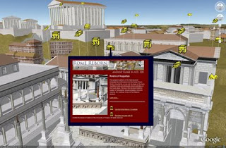
Today we introduced a new approach to learning about ancient history – the ability to go back in time and explore Rome as it existed in 320 AD – in 3D!
All of this is possible through the new Ancient Rome 3D layer in Google Earth. To activate the layer, just open the "Gallery" folder in the "Layers" panel and select "Ancient Rome 3D." To load the terrain and buildings, click on any yellow icon and then click the links at the bottom of the bubble.
The new layer, produced by the University of Virginia's Institute for Advanced Technology in the Humanities (IATH) and based on its Rome Reborn model, contains over 6,000 3D buildings and 250 Google Earth placemarks where Google Earth explorers can learn about this fascinating period of history. Our SketchUp modeling team converted the original Rome Reborn model to SKP format, then optimized the data for display in Google Earth.
This is the first time that we have incorporated an ancient city in Google Earth. Going back in time presented some new challenges, such as how to handle the ancient terrain which was clearly different than it is today. We needed to ensure that modern-day imagery, terrain and buildings didn't interfere with the Ancient Rome model, so we opted for a simple overlay.
So go ahead – fly down to the Roman Forum and experience what it may have felt like to stand on the Rostra of Augusta to deliver a political speech. Or, if you've fantasized about being a gladiator in the Colosseum, go for it: Simply fly there in Google Earth, enter through the ground level door and envision the crowds cheering you on!
Omnes viae Romam ducunt.
Posted by Bruce Polderman, Product Manager
Highlight Author Comment in Blogspot
Saturday, November 1, 2008
1. Login to blogger, then choose "Layout --> Edit HTML". Don't forget to backup your template first.
2. Check the "Expand Widget Templates" box.
3. Copy this script and put it before ]]></b:skin> or copy to your CSS area.
.comment-body-author {
background: #E6E6E6; /* Background color*/
color: #000; /* Text color*/
border-top: 1px dotted #223344;border-bottom: 1px dotted #223344;border-left: 1px dotted #223344;border-right: 1px dotted #223344;
margin:0;
padding:0 0 0 20px; /* Posotion*/
}
4. Then find this code:
<dl id='comments-block'>
<b:loop values='data:post.comments' var='comment'>
<dt class='comment-author' expr:id='"comment-" + data:comment.id'>
<a expr:name='"comment-" + data:comment.id'/>
<b:if cond='data:comment.authorUrl'>
<a expr:href='data:comment.authorUrl' rel='nofollow'><data:comment.author/></a>
<b:else/>
<data:comment.author/>
</b:if>
said...
</dt>
<b:if cond='data:comment.author == data:post.author'>
<dd class='comment-body-author'>
<p><data:comment.body/></p>
</dd>
<b:else/>
<dd class='comment-body'>
<b:if cond='data:comment.isDeleted'>
<span class='deleted-comment'><data:comment.body/></span>
<b:else/>
<p><data:comment.body/></p>
</b:if>
</dd>
</b:if>
<dd class='comment-footer'>
<span class='comment-timestamp'>
<a expr:href='"#comment-" + data:comment.id' title='comment permalink'>
<data:comment.timestamp/>
</a>
<b:include data='comment' name='commentDeleteIcon'/>
</span>
</dd>
</b:loop>
</dl>
5. The red color text is the code that you have to add to your script. The position must be right.
6. And then save your template.
* You have to login into your blogger account before to give comments.
