What kind of projects does Allied Works take on?
Allied Works can design anything, but in our history, we’ve mostly focused on museums, gallery spaces, creative work spaces, and creative educational spaces. We seek those out, but we’re also actively pursuing a lot of different programs as well.
My impression of Allied Works' design workflow has always gone something like this: Brad Cloepfil (the firm's Founding Principal) sits down with an enormous pad of paper and a lump of charcoal. He proceeds to make huge, gestural drawings that are equal parts light study, parti diagram and abstract rendering. A few years later, the building opens. What happens in between?
Let’s talk about the Clyfford Still Museum, given that it’s at the end of its cycle in terms of design and construction. It was a competition. Brad did have a stroke of insight, much like you were saying. Charcoal and pastel are his main generative tools. The project is really about the earth and about the light, so charcoal happened to be perfect. When he came into the office, he had a sketch which was about the intersection of those two things.
Then we have our design team, which sometimes includes people from outside of our office—collaborators like structural engineers and landscape architects. We spend time figuring out what all the parameters are, all the forces that are involved: cultural, civic, economic, experiential (which is huge) and structural. And then the form is derived from the mixture of all of these design elements. We do heavy investigations with material models; we do a lot of concept models to try to tease out the main essence.
Are those physical models or digital models?
In this case, they were physical models. We were trying to understand, through material manipulation and assembly, more about the experience and the form and the message of the project. "Message" is really the only word I can come up with. How is it “of the place"? How does the material itself communicate something about the experience?
Our design work strives towards a unity of space and form—the form itself trying to be a single body that’s understandable as a single body. With the Clyfford Still Museum, this was especially true. It’s kind of an unfolded plane that’s folding back on itself. It’s solid from the outside, but the space writhes and weaves together on the inside. It’s like a nine-square cube; some planes are subtracted, and some planes are moved around, with the goal of making a space that feels continuous.
The way we work on this kind of project is with physical models, which you can see in front of you and turn around, or to work in a digital 3D space that you can work on quickly. The Clyfford Still Museum was the first project where we explored the interior of the building through a digital 3D model study. We primarily used SketchUp Pro, probably because it's so FAST. And everyone participated—from the people who were actually modeling (I was one of those people), to Brad himself looking at the screen and saying Why don’t we just move this here? Let’s look at it from this other position. Let’s move this wall here, etc.
He learned how to navigate the 3D space, and by the end of the project, a lot of our design meetings were just moving through 3D models to make sure that the understanding of the space that we were going for was being supported by all the different orders that were happening in the building: the structural concrete wall order, the order of moveable art partitions, and others. We made sure that we could see through the building the way we wanted to, that everything was supporting the experience we were after.
Would you say that you typically design from the inside out, or is there an idea for an exterior form?
It’s a dialog between the two, but I think the idea for the structure, the idea for the landscape, and the idea for the experience all happen at the same time. In a lot of projects, that ends up feeling like it’s from the inside out. We’re less concerned about the facades than we are about the experience of moving through the building.


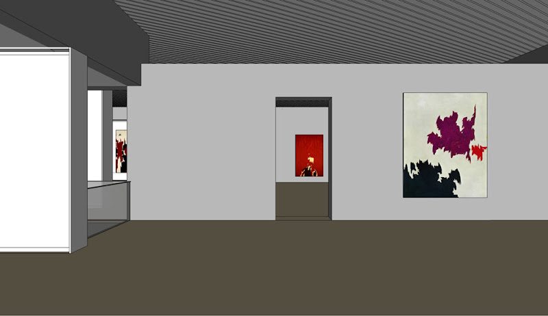
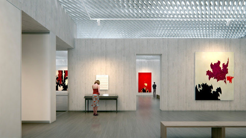
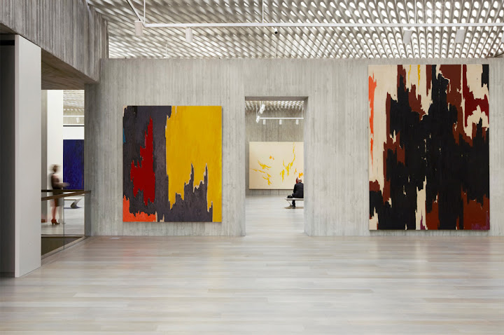
 3D investigation, representation, and result; SketchUp (top), Maxwell Render (center), and photograph (photo credit: Jeremy Bitterman)
Can you talk a little more about SketchUp's role in Allied Works’ design process?
SketchUp is a tool that we use for design studies and for visualization purposes; also, for making models that end up becoming renderings, or even drawings. We export vector lines and make them into plans or elevations or sections. Sometimes we use it for making diagrams—actually, it’s pretty useful for making diagrams, especially in concept phases or competitions, where you need either a 3D axonometric, or a section cut perspective. I know we used SketchUp to make the model for the animation for the National Music Centre project, and for some extensive renderings that were done for marketing purposes.
You talk a lot about things like light and materials and the way spaces make people feel—I think I’ve even heard the word “phenomenology” used to refer to how your firm thinks about architecture. Is there anything about SketchUp in particular that makes it useful to you, given the way Allied Works operates?
We’d want any tool we use to help us realize our vision for what the space is going to be like, in terms of its experience. I’d say that materials are key, light is key and the order of the space is key. Of those three, the last one is where SketchUp helps us work. Iterative physical models just seem to take too long to build now that we have a tool that’s much faster.
Another way to think about spatial orders is to think about sculpting space. If you’re sitting inside a network of physical planes that end up making a space, and you can see from where you are to some kernel of space that’s three floors up—and you’re seeing it through an atrium, or a matrix of walls, or something—it can only be done by building a physical model or by using 3D software.
The reason we use SketchUp is because we can do so many iterations so quickly. Our design process is very iteration-heavy. On the CSM, we iterated through the configuration of the walls and floor planes and roof plane to make it feel, at the same time, like a complex spatial organism and a single body. Getting those two things to come together is quite difficult. We probably made a thousand models of basically the same thing.
Are you serious? A thousand?
Yeah, but not full-fledged models—study models. We also use the Scenes feature to orchestrate animations of moving through the space. Because it’s not actually about single points of perspective; it’s about the experience of actually moving through the space — people don’t just stand still. I’ll click from scene to scene and we’ll review how the space unfolds as you’re moving through it. It’s like having a small physical model and turning it around in your hands, but with SketchUp, you actually get to be inside the thing.
What other design tools do you use? How does SketchUp Pro interact with the rest of your toolkit, and how does that interaction support your design process?
Extensive hand drawing, hand sketching, just to get details out. A lot of photo collage, primarily in Photoshop. A lot of concept modeling, which is different from spatial modeling. Our concept models are not white foamcore models; they’re the kind of models that you can only make in a wood shop, or through metal casting, concrete casting, or glass casting. We had a guy make a model where he hammered spikes of glass into this huge chunk of wood. He actually figured out how to do it without breaking the glass, which was ridiculous. Those are the tools we use at the beginning of our process.
Then we use Vectorworks, our drafting software, and Illustrator, and Photoshop, and SketchUp Pro to do diagramming and planning work in our programming and planning phases. When we get into schematic design, it’s basically the same toolset, and even on into design development. We end up doing generative design all the way through the end of CDs.
In some cases, we build concept models even for details. We use SketchUp Pro and Maxwell to visualize how details will look in the space, and how lighting will work. We work extensively—especially on our museum projects—with lighting designers. We’ve worked a lot with Arup Lighting Design. In the past, we’ve built 1 inch = 1 foot physical models that Arup would use for lighting analysis. These days, we’re more likely to build 3D models in SketchUp Pro to give them. They give us back rainbow-colored model renderings that tells us where the light is going to be hot and where it’s not.
What’s your workflow from SketchUp to Vectorworks look like?
Depending on the project, we export vector graphics from SketchUp Pro and import them into VW to use as a baseline for the drawings. With the CSM, we had a model that was 100% accurate to the drawings. People on the team ended up using the model to design the details before they did the drawings.
So your SketchUp model reflects what was actually built?
Almost. I think that during the construction administration phase, they didn’t keep it up—as always, there were some slight modifications made during construction. We used the 100% CD model for coordination with the mechanical engineers. I don’t know if they used SketchUp themselves or converted the model into something else, but I know it was very helpful for them. Like in a lot of our projects, the mechanical space is really tight, so coordination was tough. Having a 3D model was key.


 1st floor plan, gallery floor plan, section; Vectorworks
Is there a feature specific to the Pro version of SketchUp that you find particularly valuable?
Going through the list of Pro features, it’s obvious to me that we couldn’t make do with just the free version—primarily for the communication between different software packages. We’re always moving back and forth between SketchUp Pro and Vectorworks using DXFs or DWGs; going back and forth between SketchUp Pro and Rhino using 3DS, and sending MXS files to Maxwell Render Suite.
We also love the Solid modeling in SketchUp Pro 8. We’re doing a lot of furniture work now, and we use SketchUp Pro to do that modeling. For the current version of the furniture we’re working on, it has a lot to do with the idea of carving out of a solid body. So we model the solid body, we model the shape of the “carve”, and we subtract one from the other. Before the Solid tools in SketchUp Pro 8, we would have had to make both of those forms, intersect the two to generate the necessary edges, and delete the extraneous faces. Now I don’t have to do all that. Solid tools are definitely a big thumbs-up for me.
If we told you tomorrow that you couldn’t use SketchUp, what would happen to your design process? How would you work?
I guess someone would just have to get a lot faster on some other kind of software. None of the other programs we use are as fast; we’d be taking a step backward in terms of the speed at which we can produce design iterations and models for visualizations. It would be tough. Please don’t do that.


0 comments:
Post a Comment
please put you comment to tips and tricks 2013