A dynamic menorah for Hanukkah

Sunday, December 21, 2008

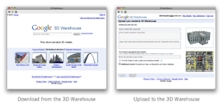
Today's the first day of Hanukkah, and I thought it might be nice to build something to celebrate the holiday. I modeled a dynamic menorah which you can download from the 3D Warehouse and work on yourself -- it isn't finished.

I set it up so that you can click on a candle base to add or subtract a candle, and click on a candle to light or extinguish it. You use the Interact tool (Tools > Interact) to click on things. Here's what it looks like so far, but please feel free to go ahead and design the rest of the menorah however you like:


Have fun, and happy holidays!

Posted by Aidan Chopra, Product Evangelist

Case Study: Blach Construction

Thursday, December 18, 2008

More and more construction firms are using SketchUp Pro to help them visualize and communicate the 3D aspects of their work. Blach Construction, based in California, is one such firm. They've been kind enough to furnish us with a description of how they use SketchUp:

Blach Construction Company has utilized Building Information Modeling (BIM) for almost 3 years and includes Google SketchUp as part of our modeling program because it provides a variety of tools to create quick, 3D building models that assist our teams during each phase of the construction process.

Accessibility. Blach Construction was initially drawn to SketchUp because it creates quick, interactive virtual models that allow our clients and construction partners to visualize projects in 3D, as opposed to traditional 2D plans.

Instant Value. Our engineers learned SketchUp quickly and were able to use it immediately. SketchUp’s modeling tools are intuitive, allowing our teams to easily create models and custom objects like plumbing fixtures for use in other BIM programs.

Blach Construction relies on 3D modeling to assist our teams throughout the construction process. Utilizing a range of tools, our teams create SketchUp models to:
  • Ensure accurate bidding. In conjunction with other modeling programs, SketchUp models assist our subcontractors’ understanding of a project’s scope, thereby increasing their confidence in the project and the accuracy of their estimates.
  • Aid constructability. SketchUp models assist our constructability reviews and create a deeper understanding of complex building and structural systems. The ability to quickly generate virtual models that produce volumes and areas, help our construction teams generate accurate material take offs and the opportunity to identify and prevent significant design issues that may otherwise lead to setbacks during construction.
New Middle School Multi-Use Building, Concrete Footings
  • Promote job site safety. SketchUp assists Blach Construction in creating safe, productive building environments and helps to reduce construction costs by equipping projects with the correct safety systems and fall protection plans. Using SketchUp, our project teams can quickly assess possible safety risks and evaluate a variety of safety solutions, reducing potential hazards and ensuring a safe job site.
New Animal Care Facility, Zoned Safety Analysis Plan

SketchUp makes 3D modeling accessible to all parties involved in the construction process. Working from a shared platform of knowledge, SketchUp provides our projects and teams with:

  • A shared vision. The use of 3D modeling ensures that Blach Construction and our clients and construction partners see the same project, increasing collaboration and effective communication. As a result of sharing the same vision, all parties involved experience enhanced coordination, substantial cost and time savings and greater satisfaction.
Performing Arts Center
  • Enhanced client involvement. SketchUp’s 3D models are easy to understand, and clients, and other decision-makers that may lack technical knowledge, can more easily understand the construction process when it is presented via 3D. With a better understanding of their project, clients are more involved and informed during project planning and throughout the course of construction.
New Animal Care Facility
  • Increased communication. Throughout the course of construction, our clients, project teams, subcontractors and architects can easily review the virtual models and walkthroughs created in SketchUp. This enables clear communication between clients and construction partners, and results smooth-running projects.


  • Marketing opportunities. As an added advantage to employing SketchUp’s 3D modeling, clients have the opportunity to promote their project prior to its completion, presenting their model to boards, agencies, investors, and the communities, to gain support or to mitigate concern.

By enabling clients, architects, engineers and contractors to utilize 3D modeling, as opposed to traditional 2D plans, SketchUp aides us in building projects more safely and cost effectively, and provide our clients with powerful marketing opportunities. SketchUp enables Blach Construction to deliver greater value to our clients while also enhancing the overall construction experience for everyone involved.

Blach Construction Company has been building structures of enduring quality and value throughout Northern and Central California for 38 years. Blach’s experience encompasses a broad cross-section of commercial, industrial and institutional building types, including education, healthcare, technology, life sciences, professional services and civic/community facilities. The company is also a leader in sustainable construction and historic preservation.

Update We included the entire text of the case study to save you a click.

Learn more about using Scenes

Wednesday, December 17, 2008

I just finished a video about using Scenes to create animations, walk-throughs and fly-throughs of your models. I also talk a little bit about working with Scenes and Sections to create animated section cuts -- definitely one of the most impressive things you can do to present your work. Check it out:


Gingerbread architecture for all

Monday, December 15, 2008

Chilly weather, hot chocolate, holiday celebrations... I'm proud to kick off our sweetest SketchUp modeling challenge ever: the first annual Google SketchUp Gingerbread House Design Competition. To make it a little easier to design the gingerbread house of your dreams, I modeled a blank house to get you started. Go ahead and download it from the 3D Warehouse, then follow the instructions in the file.


I also built a selection of decorations (candy canes, gumdrops, wafer roof tiles) that you can use to spiff up your model. Of course, you're welcome to do anything you like; it's your masterpiece. When you're finished, don't forget to label your gingerbread house with the tag "gingerbread2009" and upload it to the 3D Warehouse. The competition deadline is January 4th at midnight, Pacific Standard Time.

This undertaking is all about having fun with SketchUp, so the prizes will be glory based. (What did you expect: a gingerbread flat-screen TV?) We'll award the following prizes, and announce the winners here and on the Official Google Blog about a week after the competition closes on January 4th.
  • 1st, 2nd and 3rd place – for the best overall gingerbread houses in the collection
  • The 'Sprinkles' Prize – for the best additions to the base model (the crazier, the better)
  • The 'Swirl' Prize – for the best use of Dynamic Components in the model
  • The 'Sweet-tooth' Prize – for the most creative use of a single candy ingredient in a model

If you're looking for inspiration, take a gander at what folks did with Santa's sleigh last year. Have fun, and happy holidays.

Posted by Aidan Chopra, Product Evangelist

A new spin on 3D

Tuesday, December 9, 2008

Did you ever want to see what a 3D Warehouse model looks like in 3D, without having to open the model in Google SketchUp or Google Earth? Wouldn't it be nice to get a better look at a great model car or a character you want in a scene without waiting for a 9MB download? Today, we've launched a new feature that should help. You can now preview 3D models in your web browser, and there's no plugin required.

Here's how it works: on the model details page (the one with the large picture of the model and its description) there are now two buttons marked "Image" and "3D View". Click the "3D View" option, wait a moment, then you can click and drag left or right to spin the model. Pretty simple stuff.


When you upload a new model or update an existing one, we have to modify a couple of things before your "3D View" images can be seen. After uploading, check back in a day or two and the images should be ready to go. Okay, now head back to the 3D Warehouse and enjoy the ride!

For professionals, by (SketchUp) professionals

Monday, December 8, 2008

About a month ago, the SketchUp Sales & Marketing team was in a meeting chattering excitedly about the new features in SketchUp Pro 7. The buzz in the room got us thinking - why not create a video specifically for design professionals showing the many industries that are using SketchUp Pro and new features like Dynamic Components and LayOut 2? So we put our heads together, and thanks to Tyson's great video work, we came up with the SketchUp Pro video. Enjoy!


P.S. It's a little longer than some of our other videos (4:24), but the construction scenes at the end are well worth the wait!

Modeling for Google Earth is now easier

Thursday, December 4, 2008

Now that you've downloaded Google SketchUp 7, you may be overwhelmed by all of the new features it has to offer. Let's focus on the new photo matching tools and discover how modeling for Google Earth just got a lot easier.

Let's say we just "matched" a great corner shot of the local bank and are satisfied with the geometry and texturing of the building. Well, almost satisfied -- there are those pesky trees and bushes on every face. Two new tools, Make Unique Texture and Edit Texture will make editing out the trees quick and easy.
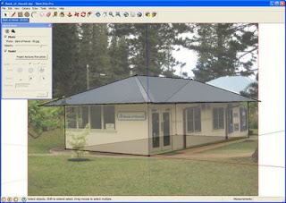

First, we'll point SketchUp towards an image editor. In this example, we'll use Photoshop, but any editor will do. Another option is GimPhoto, a free, open source software download.
  1. Window > Preferences > Applications
  2. Choose the image editor of your choice.
Let's dive in and use the new texture tools. To start, isolate the texture on our obstructed faces and make them into their own unique textures. Making a texture unique is helpful if you'd like to sample it to other faces, reduce the file size, or in this instance, take it into an image editor and work on a flat image as opposed to one in perspective. To do so:
  1. Select the face.
  2. Right-click and choose Make Texture Unique.
Finally, we'll bring the now cropped texture into our image editor to remove the trees and bushes. For information on how to remove obstructions, play with color correction, or make alpha-channel images, please visit our Modeling a City Guide PDF. Now, let's get our texture into the editor.
  1. Select the face.
  2. Right-click and hover over Texture.
  3. On the pop-out menu, select Edit Texture Image.
  4. The cropped texture will open in the image editor. Make your edits and save; the edited texture will update in SketchUp.
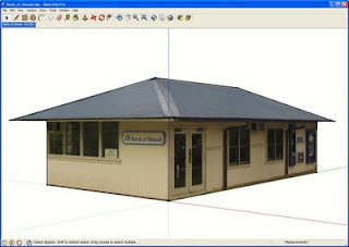
And voila! A clean, professional looking model.

If you want to submit a model to the 3D Buildings layer in Google Earth, we recommend removing any obstructions such as trees, people, and cars. While edited textures are not an explicit section of our Acceptance Criteria, it's certainly something we keep in mind when comparing two models of the same building.

Now that you know how to make models with obstruction-free textures, it's no surprise you're aching to start modeling. Check out the Help Model a City collections on the Google 3D Warehouse - with 15 different collections and almost 300 buildings ready to be modeled, there are buildings for modelers of every ability level. Each model file contains imported terrain, a sign post marking the intended building, and a description where you'll find a link to a Picasa Web Album with all of the photos you'll need.

Improved Ruby API scripts

Tuesday, November 25, 2008

The new SketchUp 7 Ruby API brings significant improvements to performance, stability, and functionality. Some enhancements include faster script performance, improved web dialogs, and there are several new methods that allow your scripts to detect your users' activity. Read about these and other improvements on the SketchUp Ruby API Blog.

Got Style?

Monday, November 24, 2008

As a designer, you use drawings to communicate much more than just the appearance of spaces or objects. Great drawings "set the tone"; they provide a window into the actual experience of your ideas. Drawings also help communicate the state of your design: Where are you in the process? What level of feedback from your clients is appropriate? Is it time to talk about the roof tile, or are you still working out the building massing? Good drawings lead to good conversations, and that leads to better design.

Style Builder lets you take hand-drawn lines (or any other lines you create) and apply them as edges in a SketchUp model. Now you can make your 3D models look like sketches, abstracting out the things you're not ready to discuss, and bringing forward the things you do. Styles you create in Style Builder are also totally unique; no one else will be able to make drawings that look like yours.

Check out this video to see how Style Builder works:


The Google 3D Warehouse in your language

Friday, November 21, 2008

One of the fun things about the 3D Warehouse is that we get to see how "globally dispersed" 3D modelers are. There are models from Brazil, China, Russia – just to name a few. Often, these models are described in the languages of the people who posted them; unless you're lucky enough to be fluent in 27 (and counting) languages, you might find our new translation feature interesting.


Using Google's new translation service, we've added a new feature that detects if a model's description is written in something other than your preferred language. If so, it offers you a translate option. So even if you don't read Simplified Chinese, you can still read about this model. And if you're having trouble remembering your German, this model is still within reach.

All about upgrades

Thursday, November 20, 2008

As you may have noticed from our long list of new features in 7, SketchUp Pro is now more powerful than ever. We're trying to make it super easy to upgrade from previous versions of SketchUp Pro to the latest one. If you have an active license for SketchUp Pro 6 (or 5, or 4, or 3, or 2, or 1), you can upgrade it to a SketchUp Pro 7 license through our online store. Once you've purchased your new, upgraded license, you'll receive an email with two important pieces of information:
  1. Link to download Google SketchUp Pro 7 (if you haven't already)
  2. License information you need to authorize it
If you want to try it out before upgrading, please feel free to download an eight-hour trial from our website.

Here are some more things to keep in mind:
  • The cost to upgrade each license is US$95, EU€64 or UK£51.
  • Please have your current serial number, registered user and company name available when you visit the upgrade portion of our store.
  • If you have any trouble upgrading, please visit our online help center for more detailed instructions.
  • If you purchased a SketchUp Pro 6 license on or after October 1, 2008, the fee is waived as long as you upgrade before or on December 31, 2008.
  • If you purchased a SketchUp Pro license through one of our authorized resellers, please contact that reseller directly for upgrade terms.
  • If you've contacted us through the Help Center recently, we will try to respond as quickly as possible. Visit this forum post for troubleshooting suggestions.
Thanks for your continued business and happy sketching!

The 3D Warehouse inside SketchUp

To help celebrate the launch of SketchUp 7, the 3D Warehouse team got together and decided to give the SketchUp product team (and the worldwide modeling community) a little gift; we made some changes so the 3D Warehouse works better with SketchUp – and not just SketchUp 7. Tom S. and I sat down to work on it, and a few cups of coffee later, here we are.

Now when you click the Get Models icon in SketchUp, you'll see a new, simplified homepage with a cleaner overview of 3D Warehouse content. You can sit back and watch the models roll by or get straight down to business by searching for what you need. Here's another hint: If you're new to the 3D Warehouse, the content under the Browse and Learn menus is also worth a closer look.

We've improved the model upload process, too. Clicking Share Model (back in SketchUp) provides you with a greatly simplified upload page. It also includes a preview of your model image and a map for geo-located models.

Matt Simpson, UX (User Experience) Designer

More about Dynamic Components

Tuesday, November 18, 2008

If you've never designed in 3D before, you probably assume that 3D objects "just know" what they are – and how they should behave – automatically. Like a staircase that knows to add steps when you make it higher. Or a tree that grows branches as it gets taller. Or a door that opens and closes when you click on it. Up until now, that wasn't possible in Google SketchUp.

But now it is.

In SketchUp 7 (which we just released yesterday), Dynamic Components are 3D models that behave like the real-world objects they represent. They make using SketchUp faster and easier than ever, so you can spend less time modeling and more time designing. They're just "smart" versions of regular SketchUp components, so you can use them in any model you're working on.

Check out this video for a basic rundown on Dynamic Components (a picture's worth a thousand words, after all...)


You can use existing Dynamic Components in both (free and Pro) versions of SketchUp, but if you want to make your own, you'll need SketchUp Pro 7. Dynamic Components work by letting you attach attributes (pieces of extra information) to SketchUp groups and components. After that, you can add formulas to create relationships and control how they interact. It's a lot like working with spreadsheets, actually.

And if you're not sure, just download SketchUp Pro 7 to play around with them. You'll find plenty of resources to help you get started: videos, FAQ, self-paced tutorials, working examples and of course, written documentation.

Sometimes you need more than a model

LayOut 2 is:
1) included with SketchUp Pro 7
2) out of Beta
3) available today!

What's LayOut? Well, it's like this...

Say you've got kids (like I do) and they've snookered you into working on a design for the new playground at their elementary school. "No problem!" you say, and you whip up a a great design and model it like a pro in SketchUp. Project done, right? Well... now the Principal would like to see the design, as would the president of the PTO. And then the fund raising committee would like a nice picture to display at the bake sale. The well-meaning contractor needs to know what it looks like, and wants to get the landscaping started today. They all think your model is great, and they all want a copy of it. Right now.

What you need is LayOut: the easy-to-use documentation tool for SketchUp models. With LayOut, you drop your SketchUp model into a pre-built document template (with professional titleblock and everything), generate a quick set of scaled drawings for the contractor, and a nice presentation perspective for the bake sale. And when you're done, you email a PDF file to everyone on the project and give the Principal a polished slide presentation in his office from your laptop.


Funds are raised, the playground is built, the kids are heroes with their friends and everybody's happy! In fact, everything is going great now, except the kids (inspired by your success with the playground) would now like you to get them a puppy. You're on your own with that one...

Drum roll please: Introducing SketchUp 7

Monday, November 17, 2008


Two years in the making and the result of many, many people's hard work, Google SketchUp 7 has arrived. You are cordially invited to visit our website to download a copy for yourself. We can't wait to see what you think.

First things first: We made a video to tell you about the new stuff in 7. I recommend watching it twice: Once to learn about what's new, and once more to see what programmers do when they're told to "just stand there" in front of a video camera. Feel free to microwave yourself some popcorn before you click "play".


You can find an exhaustive list of what's new in 7 on our (aptly named) What's New in SketchUp 7 page, so I won't bother repeating everything here. Suffice it to say, there's a lot, and we couldn't be prouder.

For SketchUp 7, we decided to focus on three main areas:
  1. Making SketchUp easier for new modelers to learn
  2. Adding "power tools" for SketchUp Pro gurus who dream in faces and edges
  3. Clearing the way for even more model sharing and collaboration
To that end, we've done everything from making small changes that make everyone's life easier (like making it so that edges automatically split other edges where they cross), to launching LayOut 2 (a whole separate program that lets Pro users create detailed multi-page documents and presentations).

Enough blathering from me – the best way to learn about 7 is to download and try it out for yourself. But before you go, three things:
  • Installing SketchUp 7 on your computer won't affect SketchUp 6; you'll have access to both versions for as long as you like.
  • If you have a license for SketchUp Pro 6 and you'd like to upgrade to Pro 7, have a look at our store to find out how.
  • Keep an eye on this blog for plenty of in-depth follow-up posts about the features and improvements in SketchUp 7. We'll be adding new stuff every day this week.
Have fun!

(on behalf of the SketchUp, LayOut and 3D Warehouse teams)

When in Rome...Teach!

Friday, November 14, 2008

This week, we introduced the new Ancient Rome 3D layer in Google Earth, a groundbreaking collection of 6,700 3D buildings modeled as leading scholars determined they stood in the year 320 A.D.

While we hope that teachers are already pretty excited to incorporate Ancient Rome 3D into their lessons, we wanted to go a step further and issue an open challenge to educators to harness the power of this new tool in the classroom. Today, we're proud to announce the launch of the inaugural Google lesson plan contest for K-12 educators in the US, the Ancient Rome in 3D Curriculum Competition. Whether you teach art history to high school students or geometry to fifth graders, the new visual tool can spice up lessons old and new. From a comparative architectural study using the ancient 3D models and modern Street View imagery to a new LitTrip of Virgil's Aeneid, the only limit is your imagination!


From Caesar to Augustus, the Roman Forum to the Arch of Constantine, it's time to get those creative juices flowing. Register and upload your original curriculum at earth.google.com/romecontest by February 9th for the chance at fame, glory, and an awesome prize package!

Guess who's going to Greenbuild 2008?

Well, not us, but our friends at IES are! We wanted to let you know because they are offering Google SketchUp Pro customers a discount on their new Architectural Suite and Architectural Suite Plus software. Here's the deal: If you go to the Greenbuild Expo in Boston next week, visit the IES Booth (#1447) and you'll receive $250 off their software using the promo code GB08. This offer is also available on their website. If you're going to the conference to learn about building green, you may as well save some green while you're there.

See roman history come to life in 3D

Wednesday, November 12, 2008

Were you someone who struggled to stay awake in ancient history class? If so, perhaps this was due to those uninspiring "artist renditions" in your textbook. Reading countless pages that described how a monument, building or city may have appeared can be a pretty difficult way for the average reader to form a mental picture.

Today we introduced a new approach to learning about ancient history – the ability to go back in time and explore Rome as it existed in 320 AD – in 3D!

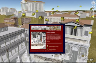
All of this is possible through the new Ancient Rome 3D layer in Google Earth. To activate the layer, just open the "Gallery" folder in the "Layers" panel and select "Ancient Rome 3D." To load the terrain and buildings, click on any yellow icon and then click the links at the bottom of the bubble.


The new layer, produced by the University of Virginia's Institute for Advanced Technology in the Humanities (IATH) and based on its Rome Reborn model, contains over 6,000 3D buildings and 250 Google Earth placemarks where Google Earth explorers can learn about this fascinating period of history. Our SketchUp modeling team converted the original Rome Reborn model to SKP format, then optimized the data for display in Google Earth.

This is the first time that we have incorporated an ancient city in Google Earth. Going back in time presented some new challenges, such as how to handle the ancient terrain which was clearly different than it is today. We needed to ensure that modern-day imagery, terrain and buildings didn't interfere with the Ancient Rome model, so we opted for a simple overlay.

So go ahead – fly down to the Roman Forum and experience what it may have felt like to stand on the Rostra of Augusta to deliver a political speech. Or, if you've fantasized about being a gladiator in the Colosseum, go for it: Simply fly there in Google Earth, enter through the ground level door and envision the crowds cheering you on!

Omnes viae Romam ducunt.

Highlight Author Comment in Blogspot

Saturday, November 1, 2008

This trick is to give a Highlight Author Comment . This will make the blog's owner comments looks different from the visitors comments. It's very usefull and interesting blogger hack tips. You can see the example in my blog. Here is what to do to make a "Highlight Author Comment" effect in Blogspot.


1. Login to blogger, then choose "Layout --> Edit HTML". Don't forget to backup your template first.
2. Check the "Expand Widget Templates" box.
3. Copy this script and put it before ]]></b:skin> or copy to your CSS area.

.comment-body-author {
background: #E6E6E6; /* Background color*/
color: #000; /* Text color*/
border-top: 1px dotted #223344;border-bottom: 1px dotted #223344;border-left: 1px dotted #223344;border-right: 1px dotted #223344;
margin:0;
padding:0 0 0 20px; /* Posotion*/
}


4. Then find this code:

<dl id='comments-block'>
<b:loop values='data:post.comments' var='comment'>
<dt class='comment-author' expr:id='"comment-" + data:comment.id'>
<a expr:name='"comment-" + data:comment.id'/>
<b:if cond='data:comment.authorUrl'>
<a expr:href='data:comment.authorUrl' rel='nofollow'><data:comment.author/></a>
<b:else/>
<data:comment.author/>
</b:if>
said...
</dt>

<b:if cond='data:comment.author == data:post.author'>
<dd class='comment-body-author'>
<p><data:comment.body/></p>
</dd>
<b:else/>


<dd class='comment-body'>
<b:if cond='data:comment.isDeleted'>
<span class='deleted-comment'><data:comment.body/></span>
<b:else/>
<p><data:comment.body/></p>
</b:if>
</dd>

</b:if>

<dd class='comment-footer'>
<span class='comment-timestamp'>
<a expr:href='"#comment-" + data:comment.id' title='comment permalink'>
<data:comment.timestamp/>
</a>
<b:include data='comment' name='commentDeleteIcon'/>
</span>
</dd>
</b:loop>
</dl>


5. The red color text is the code that you have to add to your script. The position must be right.
6. And then save your template.

* You have to login into your blogger account before to give comments.

Create Vertical Menu

Friday, October 17, 2008

We have learned how to create horizontal menu before. Now we will try to make a vertical menu. We will make a vertical menu like the image. Ok let's do it

1. Login to blogger then choose "Layout-->Edit HTML"
2. Put the script below before this code ]]></b:skin> or put it in CSS code area.

.glossymenu, .glossymenu li ul{
list-style-type: none;
margin: 0;
padding: 0;
width: 185px; /*WIDTH OF MAIN MENU ITEMS*/
border: 1px solid black;
}
.glossymenu li{
position: relative;
}
.glossymenu li a{
background: white url('http://blog.superinhost.com/vertical/blue1.gif') repeat-x bottom left;
font: bold 12px Verdana, Helvetica, sans-serif;
color: white;
display: block;
width: auto;
padding: 5px 0;
padding-left: 10px;
text-decoration: none;
}
.glossymenu li ul{
position: absolute;
width: 190px;
left: 0;
top: 0;
display: none;
}
.glossymenu li ul li{
float: left;
}
.glossymenu li ul a{
width: 180px;
}
.glossymenu li a:visited, .glossymenu li a:active{
color: white;
}
.glossymenu li a:hover{
background-image: url('http://blog.superinhost.com/vertical/blue2.gif');
}

* html .glossymenu li { float: left; height: 1%; }
* html .glossymenu li a { height: 1%; }


You can change the menu color, look at the red text (blue1.gif and blue2.gif). Change it with some color menu below. For example, if you want to choose red color, then the code would be like this :

.glossymenu li a{
background: white url('http://blog.superinhost.com/vertical/red.gif') repeat-x bottom left;


dan

.glossymenu li a:hover{
background-image: url('http://blog.superinhost.com/vertical/red.gif');


Vertical Menu Color :

blue1.gif

blue2.gif

green1.gif

green2.gif

red1.gif

red2.gif

pink1.gif

pink2.gif

black1.gif

black2.gif


3. Save your template.
4. Then go to "Page Elements" menu
5. choose "Add a Gadget -->HTML/JavaScript" the insert the code below.

<ul id="verticalmenu" class="glossymenu">
<li><a href="/">Home</a></li>
<li><a href="http://trik-tips.blogspot.com">Trik Blog</a></li>
<li><a href="http://x-template.blogspot.com" >Free Template</a></li>
<li><a href="http://getebook.co.cc">Free Ebook</a></li>
</li>
</ul>


Note :
- The red code is the links.
- The Blue code is anchor text.
- If you want to add menu, just copy the blink code and paste it.

6. Then click "Save"

Create Tab View

Tuesday, September 30, 2008

Tab View is very usefull box. We can fill it with many contain. It will save our blogs area. (See Image Below)


Here is Tutorial how to create a tab view:

1. Login to blogger, go to "Layout --> Edit HTML"
2. Then find this code ]]></b:skin>
3. Insert the below code before ]]></b:skin> or in CSS tag.

div.TabView div.Tabs
{
height: 24px;
overflow: hidden;
}
div.TabView div.Tabs a
{
float: left;
display: block;
width: 90px; /* Width top main menu */
text-align: center;
height: 24px; /* Height top main menu */
padding-top: 3px;
vertical-align: middle;
border: 1px solid #000; /* Top Main menu border color */
border-bottom-width: 0;
text-decoration: none;
font-family: "Times New Roman", Serif; /* Top main menu font */
font-weight: 900;
color: #000; /* Top main menu font color */
}
div.TabView div.Tabs a:hover, div.TabView div.Tabs a.Active
{
background-color: #FF9900; /* Top main menu background color */
}
div.TabView div.Pages
{
clear: both;
border: 1px solid #6E6E6E; /* Content Border color */
overflow: hidden;
background-color: #FF9900; /* Content background color */
}
div.TabView div.Pages div.Page
{
height: 100%;
padding: 0px;
overflow: hidden;
}
div.TabView div.Pages div.Page div.Pad
{
padding: 3px 5px;
}


4. You can change the code according to the red text explanation. To get html color code see HERE
5. The next step is put the code below before </head>

<script src='http://superinhost.com/trikblog/tabview.js' type='text/javascript'/>


6. Then "save" it.
7. Go to "Page Elements" menu
8. Chose "Add Page Element" --> "HTML/Javascript" in place where you want to put this tab.
9. Insert this code :

<form action="tabview.html" method="get">
<div class="TabView" id="TabView">
<div class="Tabs" style="width: 350px;">
<a>Tab 1</a>
<a>Tab 2</a>
<a>Tab 3</a>

</div>
<div class="Pages" style="width: 350px; height: 250px;">

<div class="Page">
<div class="Pad">
Tab 1.1 <br />
Tab 1.2 <br />
Tab 1.3 <br />

</div>
</div>

<div class="Page">
<div class="Pad">
Tab 2.1 <br />
Tab 2.2 <br />
Tab 2.3 <br />

</div>
</div>

<div class="Page">
<div class="Pad">
Tab 3.1 <br />
Tab 3.2 <br />
Tab 3.3 <br />

</div>
</div>


</div>
</div>
</form>

<script type="text/javascript">
tabview_initialize('TabView');
</script>


Note :
- The number or the blue text(350px) Is size of the tabview.
- The green code is the main menu text
- The red code is the content of tabview. you can fill it with links, banner, widget, comment or anything.
- To add more menu, see on the blink code. Add the code under it.

Good luck every body.


Show Recent Comments

Sunday, September 7, 2008

It's very usefull to Show Recent Comments on main blog page. We can know who have given comments on aur articles without open it one by one. At this time I will show you how to show recent comments on our main page blog. It's very easy


1. Login to blogger then go to "Layout"
2. Then copy this code :

<script style="text/javascript" src="http://superinhost.com/blog/comments.js"></script>
<script style="text/javascript">
var numcomments = 8;
var showcommentdate = true;
var showposttitle = true;
var numchars = 100;
var standardstyling = true;
</script>
<script src="http://trick-blog.blogspot.com/feeds/comments/default?alt=json-in-script&callback=showrecentcomments"></script>


- The 8 number is the sum of comments that will show up.
- Change trick-blog.blogspot.com with your blog's name.

3. You can show it in page elements. Just click on "add page elements --> HTML/Javascript" Then insert the script in it.

Or you can plug it in the "Tab View"

Setting Domain Blogspot With co.cc Domain

Thursday, July 17, 2008

co.cc is a free domain. It's not only URL forwarding but we can setup DNS Records, A, MX, and CNAME records. We can change our blog's name to become "name.co.cc". It's more simple than we use domain "name.blogspot.com". To change our default blogspot name to co.cc domain name there are some steps to do. Here is the tutorial to setup domain co.cc


1. Open your browser to co.cc
2. Then regiter a domain that you want to use.
3. If it's no available you have to find another domain name. But if it's available then you can register it.
4. The you have to setup your domain. Got to "setup-->Manage domain"
5. Choose "Zone Records"
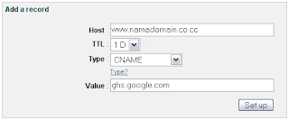
6. In the coloumn "Host" fill it with your domain name (www.yourdomainname.co.cc")
7. Choose "CNAME" for "Type"
8. In the "Value" box fill it with "ghs.google.com"
9. Then click "Setup" Button.


The next step is make some setup in blogspot.

1. Login to Bloggr/blogspot then choose "Setting-->Publishing"
2. Then choose "Switch to: • Custom Domain
3. Then click on "Already own a domain? Switch to advanced settings"
4. Fill it with your new domain in the "Your Domain" coloumn.


5. To Finish click "Save Setting" Button.

It will take 1-48 hours for your new domain to work. So be patient....

Blogger Under Posting Comment box

Saturday, June 28, 2008

Now, blogger(blogspot) have developed their comment box. Last time ago, if we want to post a comment there should be only a link under our posting, and we have to click the link send a comment, it's not interesting. But now we can find a comment box under our post exactly. It's original from blogger, it's not like haloscan or intensedebate. But it's truely from blogger/blogspot. You can see it under this post.
Here is the trick to create comment box under your post.

1. Login to http://draft.blogger.com
2. Go to Setting-->Comments. then change "Comment Form Placement" to be "Embedded below post" (look at the image below)


3. Then "Save Setting"
Try to see your blog and klik on your titile post. if there is a embadded commnet box below your post just stop this step here. But if there is no comments box, just follow the next steps here.

4. Go to "Layout-->Edit HTML"
5. Check the "Expand widget templates" box.
6. Find this code :

<p class='comment-footer'>
<a expr:href='data:post.addCommentUrl' expr:onclick='data:post.addCommentOnclick'>
<data:postCommentMsg/></a>
</p>
</b:if>


7. Then replace it with this code :

<p class='comment-footer'>
<b:if cond='data:post.embedCommentForm'>
<b:include data='post' name='comment-form'/>
<b:else/> <b:if cond='data:post.allowComments'>
<a expr:href='data:post.addCommentUrl' expr:onclick='data:post.addCommentOnclick'>
<data:postCommentMsg/></a>
</b:if> </b:if> </p> </b:if>


8. Save your Template.

I've deleted my last comment box (haloscan). so now I lost all of my comments before. I do it to get this comment box.

Show Related Article to Your Post

Monday, June 16, 2008

The advantage of showing related article to your post is it will help your readers find more information related to the topics. This is base on label or category. This is usually put to the end of the article. After your visitors finish read your article, they will find some links that related to the post base on label or category.
Here's the tutorial to create "related article to your spot":

1. Login to Blogger
2. Go to "Layout-->Edit HTML"
3. Click on "Expand Widgets Template" checkbox.
4. Then download THIS SCRIPT or HERE.
5. Open it then copy the scripts.
6. Paste the script after this code : <data:post.body/>. If you have "Read more widget" you will find two codes. Put it under the first code.
7. Save your template.

Good Luck...

Free Web Hosting Without Ads

Sunday, June 8, 2008

If we have a/some blogs, webhosting is important to support our blog running. web hosting is use for put our files such as images, sound, script, videos and many more. We can use use paid hosting or free hosting, but I suggested you to use 000webhost as your web hosting. 000webhost is a free web hosting service with full feature and no force ads. 000webhost is an amazing web hosting service. It's free web hosting that gives many features such as:
- 250 MB Disk Space
- 100 GB Data Transfer
- cPanel Control Panel
- Fantastico De Luxe 1-Click Autoinstaller
- Website Builder Software
- PHP Scripts Autoinstaller
- MySQL Databases
- Curl, GD2 library, ImageMagick, Zend
- and much more features are enabled

But to make your web hosting running well you must folow their rule.
Here is the most important rules:

1. No adult content or any kind.
2. No warez / hacking / phishing sites
3. No mass mailers / spammers (account will be automatically suspended if you will try to send mass mail), so if your software supports such feature, disable it right now.
4. We do not allow any public image or file hosting server scripts to be run.
5. Chat, proxy, or file download scripts are not allowed.
6. Paid-to-surf, auto-surm, buxto, and any other similar scripts are banned
7. We do not allow online gaming scripts such as ogame, mafia, etc..
8. Nulled software such as ip.board or vbulletin is not allowed to be hosted
9. Account cannot be used only to store files.

What are you waiting for, just SIGN UP HERE

Free Domain co.cc

Wednesday, June 4, 2008

Do you feel your blog name is too long?
If we create a blog, use blogspot or wordpress service, we have to make a name to our blog, it should be like "name.blogspot.com" or "name.wordpress.com". Do you feel it's such as a long name? If we have some money, we can buy a domain, and then our blog name would be like name.com or name.net or name.co.uk name.us etc.

But now, we can to get free domain to cut up our blog name. it's co.cc service. We can register domain to co.cc, our blogname will be like "name.co.cc". It's free, no payment needed, no setup fee and it's easy to setup. I thinnk it's very good service that offer us a free domain name. I have try it for some of my blogs, and it's interesting. So what are you waiting for.....

CO.CC:Free Domain

Get Paid From Bloggerwave

Friday, May 30, 2008

Bloggerwave is one of PPP (Pay Per Post) Program. It's like sponsoredreviews, buyblogreview and other PPP program. They provide some jobs to be reviewed by bloger. It's such as writing an article about a website or company and then we post it in our blog. To be approved to Bloggerwave is easier than other PPP programs. No PR needed or any others criteria. So I thing this is a good PPP program


HTML Color Codes

Sunday, May 25, 2008

Color is very important to design a blog. But to give a color to background or text or table it's not as simple as looks like, we have to know tho color code. With HTML color codes you can set the color of web site background, color of text, cells in tables and much more. With this dynamic HTML color codes chart you can get codes for basic colors.
Click on any color to get it's HTML color code:


Back up Your Blog

Saturday, May 10, 2008

Back up blog? is it important?
Yes it's very important. Because we can't guarantee that our blog will exist forever. Lately, many blogers lost their blogs because of unpredicted fault . Few months ago I lost all of my blog (it'a about 10 blogs), but now I got some of them back. Since then I know how important to back up our blog. It's really frustating when your hard work suddenly lost.

There is a free service website that allow us to back up our blog. It's name is blogbackuponline. They give us a space for 5 MB. Althought it's small but I think it's enough for us to backup our blog. If our avarage posted arcticle is 1000 character, meaning it can backup until 5000 title. It's for free version. They also provide more features for premium account. Just go to blogbackuponline and back up your blog there.

Put Paypal Donation Box to Blog

Sunday, May 4, 2008

Do you want to put this box in your blog/site? Well many of us want put this code on their own blog/site like those popular sites but they don't know how. Well i am very glad to teach you and going tell you how.
If you don't have a paypal account, click here to sign up one. Well i supply the code, and you just simply copy and paste it, is that simple.
Ok here we go.


Just copy the code and change some values in red.
Change Blog/Website Title to your own Blog title example change to "The-Online-Quest".
And change Your paypal email to your own paypal email.

Code:

<!-- The-Online-Quest Pay Pal Donation Form Code Start -->

<center>
<table border="1" width="143" cellspacing="0" cellpadding="0" bordercolorlight="#FFF8E8" bordercolordark="#EFE0C9">
<tr>
<td>
<p align="center"><b>Please Donate To My Blog</b>
</p></td>
</tr>
<tr>
<td width="145">
<form action="https://www.paypal.com/row/cgi-bin/webscr" name="_xclick" method="post">
<input value="Thanks for Your Donations - Blog/Website Title" name="item_name" type="hidden"/>
<input value="Your paypal email" name="business" type="hidden"/>
<p style="margin-top: 0; margin-bottom: 0">
<input value="_xclick" name="cmd" type="hidden"/>
<!-- input type="hidden" name="amount" value="1.00" -->
<b>Amount</b> <p style="margin-top: 0; margin-bottom: 0"> <select name="Amount" size="1">
<option selected value="1.00"/>1.00
<option value="2.00"/>2.00
<option value="3.00"/>3.00
<option value="4.00"/>4.00
<option value="5.00"/>5.00
<option value="10.00"/>10.00
<option value="15.00"/>15.00
<option value="20.00"/>20.00
<option value="25.00"/>25.00
<option value="30.00"/>30.00
<option value="35.00"/>35.00
<option value="40.00"/>40.00
<option value="45.00"/>45.00
<option value="50.00"/>50.00
<option value="100.00"/>100.00
<option value="200.00"/>200.00
<option value="300.00"/>300.00
<option value="400.00"/>400.00
<option value="500.00"/>500.00
<option value="1000.00"/>1000.00
</select>
<p style="margin-top: 0; margin-bottom: 0"><b>Currency</b> <select name="currency_code" size="1">
<option value="AUD"/>Australian Dollar
<option selected value="USD"/>USD
<option value="GBP"/>British Pound
<option value="CAD"/>Canadian Dollars
<option value="CZK"/>Czech Koruna
<option value="DKK"/>Danish Kroner
<option value="EUR"/>EUR
<option value="HKD"/>Hong Kong Dollars
<option value="HUF"/>Hungarian Forint
<option value="JPY"/>Japanese YEN
<option value="NZD"/>New Zealand Dollars
<option value="NOK"/>Norwegian Kroner
<option value="PLN"/>Polisg Zlotych
<option value="SGD"/>Singapore Dollars
<option value="SEK"/>Swedish Kronor
<option value="CHF"/>Swiss Francs
</select>
</p>
<p style="margin-top: 0; margin-bottom: 0" align="center">
<input border="0" alt="Make payments with PayPal - it's fast, free and secure!" width="60" src="http://www.blogpulp.com/imagehost/images/5971708800.gif" name="submit" height="30" type="image"/>
</p>
</p></p></form>
</td></tr>
<tr>
<td>
<p align="right"><b><font face="Arial" size="1">Powered by <a href="http://djyano.blogspot.com/2008/04/put-paypal-donation-code-to-your.html" target="_blank"> The-Online-Quest</a></font></b>
</p></td>
</tr>
</table>
</center>

<!-- End of The-Online-Quest Pay Pal Donation Form Code -->


For blogger, after you have copied and changed the values, just add a new page element. Click add HTML/JavaScript to blog, paste all the codes in and save changes.Enjoy blogging and have fun, if you have put this code in your blog/site, post a comment about it and please let me know.

Original post by : The Online Quest

How to Create Dropdown Menu

Wednesday, April 9, 2008

What is dropdown menu?
Dropdown menu is like this :


Here is the trick how to create dropdown menu :

Copy the code below and put it on your page elements.


<select onChange="document.location.href=this.options[this.selectedIndex].value;">
<option value="0" selected>Blog Archive</option>
<option value="Links 1">Text 1</option>
<option value="Links 2">Text 2</option>
</select>

The red text is links, change it with your links.
The blue text is Anchor text. Yau must change it.

For example :


<select onChange="document.location.href=this.options[this.selectedIndex].value;">
<option value="0" selected>Blog Archive</option>
<option value="http://trick-blog.blogspot.com/2008/02/tutorial-to-create-dtree-menu.htmll"> How to Create Dtree Menul </option>
<option value="http://trick-blog.blogspot.com/2008/01/how-to-create-search-engine-in-blogger.html"> How to Create Search Engine </option>
</select>

The result would be like this:


To add more menu/item, put a code like below

<option value="Links 3">Text 3</option>

before this code </select>

If you want the links opened in new window, change the code below

<select onChange="document.location.href=this.options[this.selectedIndex].value;">

with this code ::

<select onchange="javascript:window.open(this.options[this.selectedIndex].value);">

The resul would be like this:


Free Unlimited File Hosting Service

Thursday, April 3, 2008

If we have a web/blog especially about downloading like mp3, video, ebook etc, it’s need a webhost to put these files, and usually we like a free webhosting rather than paying. But there are some problems/limitations if we chose a free file hosting like :Bingung Cari Tempat Hosting Gratis Dan Unlimited?

- Limited capacity/storage.
- No store big files bigger than 5 MB (Usually).
- traffic limitation (base on time)
- etc.

Now I have a solution to solve the problems. Try to use ziddu. ziddu is one of the free unlimited file hosting service. What will you get from ziddu? here is :

- Unlimited storage, (you can upload your files as much as possible).
- maximum file size to uploaded is 200 MB (it’s big enough)
- No huorly traffice limitation.
- Get paid everytime others download your files.
For the last poin, is it true that we will get paid everytime others download files?
Yes, it’s 100% true. You will get paid $0.001 per unique download. Cash will be transfered via paypal.

If you interesting SIGN UP HERE

How to Create Float Image

Monday, March 31, 2008

This tutorial is about to create float image that will always show on your corner blog althought you drag side scroll bar. see example. You can put an image, widget, clock etc on the corner.
Step by step to create Float image.

1. Login ke blogger then click "Layout -->> Edit HTML
2. Find this code ]]></b:skin>, then put the code below above it.

#float_corner {
position:fixed;_position:absolute;bottom:0px;left:0px;clip:
inherit;_top:expression(document.documentElement.scrollTop+document.documentElement.clientHeight-this.clientHeight);_left:expression(document.documentElement.scrollLeft + document.documentElement.clientWidth - offsetWidth);}


3. The bold text is it’e position. you can change it with "top", "bottom", "left", "right"
4. The next step is put the code below before tag</body>

<div id="float_corner">

<a href="http://trik-tips.blogspot.com"> <img src="


http://blogoholic.info/files/soniclari.gif
" border="0" /></a>

</div>

"http://trick-blog.blogspot.com" is a link.
"http://blogoholic.info/files/soniclari.gif" is image URL, Change it with your own image.

5. If you wanna fill it with a widget, change the red code with your widget code.
6. Save and preview your blog.

How to Create Email Form Subscription

Friday, March 21, 2008

The function of Email Form Subscription is to let your loyal visitors to subscribe your new article/posting in to their email. So if your post a new article your subscriber will receive your article automatically. It’s very usefull, your subscriber will know if there is a new article, so they will come to visit your blog immediatly.
Here the trick to create Email Form Subscription

1. visit this site : http://www.feedburner.com
2. You will see a box to enter your blog feeds. enter your blog feeds in to the box. Usually your blog feeds is like this : http://YOURBLOGNAME.blogspot.com/feeds/posts/default
3. If you have video file in your blog content, check on the "I am a podcaster"box, If not, it’s unnecessary. Then click "Next" Button.
4. After that, you must to fill a form, fill it with your information then click on the "Activate Feed"
5. If you’re succeed, you will see "Congrats your....." notificaton.
6. On the buttom you will see a "Next" Button and a link "Skip directly to feed management", choose this link.
7. You will see some menus on top. Choose "Email Subscription" menu.
8. On the left you will see some menu again, now click on the "Email Subscriptions"
9. Then click on the "Activate" button.
10. You will some code on the boxes. Choose code in the "Subsciption Form Code" box, and copy it. then click "Save" Button.

11. To plug it on your blog, go to "Layout-->>Add Page element-->HTML/Javascript" paste your code on the box.

See your blog, Now you have an "Email Form Subscription"
Congrats....

How to Create Blogroll (Link List Box)

Monday, March 10, 2008

As a bloger, we usually added our Friends link on our blog. Day by day and month by month it's number will increased. But if your friends link over than hundredsor or even thousands, it will be a problem, your blog space will full of your friends link list.
Now I will show you how to create a blogroll, a box to place your friends link list. You can fill it with as many as links, and it's size will not get bigger. So it will save space on your blog or sidebar. The box will be like mine.

Here's the code that you should to copy and place on your blog or sidebar ("Add Page Element --> HTML/Java Script").


<div style="border: 1px solid rgb(153, 153, 153);
overflow: auto;
width: 200px;
height: 300px;
text-align: center; ">

#link1 <br />
#link2 <br />
#link3 <br />
#link...

</div>


Note:
- Text width: 200px; and height: 300px; is size of the box, you can change it according to your place or sidebar size .
- Change the text "#link1,#link2, #link3 dst" with your friends link list.

Display Yahoo Messenger Status on Blog

Wednesday, March 5, 2008

The advantage of showing Yahoo Messenger status on your blog is your visittors can talk or ask something to you directly via YM, it will make your relationship with your visitor to be more tighly. Ok lets begin.

If you’re oflfline, it will display image like this:


And if you’re online, it will display icon like this:


It’s very simple to create it. You just copy the code below and put it on your "Page Element" or sidebar.


<a href="ymsgr:sendIM?kendhin_x"> <img src="http://opi.yahoo.com/online?u=kendhin_x&amp;m=g&amp;t=2&amp;l=us"/>
</a>


Change the red text (kendhin_x) with your YM id.
Look at the green number "2", you can change it. What the result of doing this? you will different image/icon as your YM status.

You must try it !!!!

How to Show Recent Post on the Sidebar

Wednesday, February 27, 2008

To show your recent post on the sidebar is very easy, you just follow the instruction below then you will see your recent post on your blog sidebar. here’s the steps :

1. Login to Blogger then Chose "Layout"
2. Click on "Add page element" (chose where you want to put it) then chose "HTML/Javascript"
3. Copy the code below and put it in the "content" box.

<script src="http://www.geocities.com/uddin_81/recent-post.js"></script>
<script>var numposts = 10; var showpostdate = false; var showpostsummary = false; var numchars = 100; </script>
<script src="http://YOURBLOGNAME.blogspot.com/feeds/posts/default?orderby=published&amp;alt=json-in-script&amp;callback=rp">
</script>


4. Change YOURBLOGNAME with your blogname.
5. The number "10" it’s amount of recent post that will be shown, You can change it.
6. Click Save.

Get Try it .......

Widget to Put Comment Box Under Posting

Thursday, February 21, 2008

Sometimes ago I have posted an articel about "How to Create Commnet Box Under Posting" it use haloscan comment box. It working well for some bloger and bad for some bloger too. If you failed or dislike using haloscan comment box, may be this will be alternatifvfor you. This comment box is created by intensedebate.com, this comment box can be use as a widget, and to apply this widget is very simple, and to remove this is more simple it just like when you remove Page Element from your blog. Ok, if you interest to try this widget I’ll show you how to put it.


1. Login to Blogger.com the chose "Layout --> Edit HTML", click on the link "Download Full Template" to backup your template first


2. Then go to intensedebate.com site sgn up, the login and go to "dashboard"


3. On the up right you will see "add blog" button, click the button


4. Then you will see a box to insert your blog url, fill it then press the button .


5. Then you will see a page like this:


intense


6. For easy, chose"Widget (Recomended)".


7. There are some choice on the "Replace Comment System". Chose "On post without comments" if you want the comment box show under no comment articel (your previouse comment still exist). If you want the comment box exist on every posting chose "On all blog post" (You will lose your previouse comments, but it can be restored).


8. The click "Complete Installation" button.


9. You will see the page like this :


addwidget


10. Chose your blog then click "ADD WIDGET" button.


Finish...

Tutorial to Create DTree Menu

Tuesday, February 19, 2008

DTree is a menu that be arranged like a tree. It will be like menu when you open "windows Explorer". It's very usefull if you have many posting (articel) in your blog. It can contain many link in small space. It will be like the below image :


Here's the step by step tutorial to create "DTree Menu" in blogger:

1. Login to Blogger, go to "Layout --> Edit HTML"
2. Put the code below over <head>

<link rel="StyleSheet" href="http://blogoholic.info/files/dtree/dtree.css" type="text/css" />
<script type="text/javascript" src="http://blogoholic.info/files/dtree/dtree.js"></script>


3. Save your editting.

4. Now edit end copy the below code then put on your sidebar.

<div class="dtree">
<script type="text/javascript">
<!--
d = new dTree('d');
d.add(0,-1,'My example tree');
d.add(1,0,'Node 1','link.html');
d.add(2,1,'Node 1.1','link.html');
d.add(3,2,'Node 1.1.1','link.html');
d.add(4,3,'Node 1.1.1.1','link.html');
d.add(5,0,'Node 2','link.html');
d.add(6,5,'Node 2.1','link.html');
d.add(7,5,'Node 2.2','link.html');
d.add(8,0,'Node 3','link.html');
d.add(9,0,'Node 5','link.html');
document.write(d);
//-->
</script>
</div>


Change "link.html" with your own link.
The first number must be unique (d.add(1,0,'Node 1','link.html');
The second number is child of the number (look at the color).

You can add the below code to add a new node with your own image

d.add(10,0,'Profile','link.html','','','http://blogoholic.info/files/dtree/trash.gif');

change "http://blogoholic.info/files/dtree/trash.gif" with your own image.
it will be like this :