3D tours added to the Google Earth Gallery

Thursday, May 28, 2009

If you're a 3D enthusiast, then you'll probably enjoy the latest addition to the Google Earth Gallery: 3D Buildings. This new category provides a number of self-running tours on various themes. The tours showcase some fascinating 3D buildings (along with bridges and statues and other structures) around the world, most of which were built by our passionate Google SketchUp users who model buildings for Google Earth. Whether your interest is castles, bridges, museums, baseball stadiums or skyscrapers, I think you'll find a self-guided tour that is of interest to you.

The tours were developed by geo-modelers Adam and Jordan, both of whom are 3D experts who really know their way around Google Earth.


To play a tour, simply click on the "Open in Google Earth" link to download the KML file. Then click the "Start tour here" link in the "Places" panel in Google Earth (download the latest version of Google Earth). Make sure the "3D Buildings" layer is checked in the "Layers" panel. The tour will pause at each location to ensure the 3D building is fully loaded. Click the play button to continue the tour. Enjoy!

Save some cash on SketchUp Pro

Instead of producing a late-night infomercial for SketchUp Pro (Buy two copies, get a free pocket protector), we decided to go a simpler route: Helen put together a promo code that knocks $100 US off the price of a new single-user Pro license (it's normally $495). European and UK customers save 20%, which works out to about the same thing.

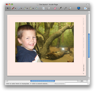
Here's the catch: Chris designed the promo coupon into a LayOut 2 doc – you'll need to have LayOut 2 installed on your computer to open the file and read the coupon. If you haven't already, you can download a trial version of SketchUp Pro 7 (which includes LayOut 2) in order to open the file. Sneaky, no?

Once you've installed SketchUp Pro 7, you can download the promo coupon and see it in LayOut. Mosey on over to our online store to take advantage of the discount until June 19th of this year.

Update: If you can't open the LayOut file with the promo code because you've used up all 8 hours of SketchUp Pro trial time, here's a workaround.

Drag and drop your models with Creator

Wednesday, May 27, 2009

Esperient Creator is an interactive 3D application-authoring tool, that provides a WYSIWYG approach to creating interactive 3D applications. It's compatible with Google SketchUp and integrates right into your workflow. John D'Amours, President and Founder of Visual Training Solutions, uses Google SketchUp and the Google 3D Warehouse to create or find content. He then brings that content "to life" with Esperient Creator. He says, “SketchUp provides some great home furnishings, accents, and even unique materials and textures that can easily be modified and brought to life in RH and Esperient Creator. This is extremely useful for creating 3D instructions for improvement projects around the house, employees, and even marketing and communication tools. You never know what you’ll find in the Google 3D Warehouse…I always check there first.”

Check out this video that highlights a number of workflows using Google SketchUp and Google 3D Warehouse with Esperient Creator.


Modifying SketchUp models in LayOut

Tuesday, May 26, 2009

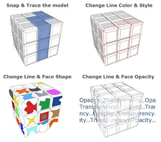
If you want more control over the style, weight and color of your model's lines or faces - LayOut can help (LayOut is included with Google SketchUp Pro 7). By applying the "Explode" feature to your model view in LayOut, you can convert it into LayOut 2D vectors. After the conversion, you will be able to snap to individual lines and faces, change their style, type, weight, color, and even their opacity.


Convert a model to 2D vectors:

1) After loading your model into the LayOut document, find the view you want to work with. Be sure the view is exactly what you want to see in vector form because the connection to the orginal SketchUp model will be cut off.

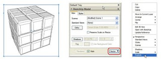
2) Open the SketchUp Model dialog box (Window > SketchUp Model). With your SketchUp model selected, look under the "View" tab and you will be able to change the model rendering style from the default style of "Raster" to either "Vector" or "Hybrid". Change your model to "Vector".

3) Now that your model has been rendered as a "Vector", right click on the model or go to the Edit menu and select "Explode".


After selecting "Explode", your model will be converted into LayOut 2D vectors. All the vectors will be grouped together automatically. You can now ungroup the vectors and modify any of the elements you want. Stay tuned for more tips on using LayOut.

Disneyland Paris in Google Earth

Last summer The Walt Disney Company took a big step into the realm of virtual tourism by introducing the Walt Disney World park located in Orlando, Florida in Google Earth, much to the delight of children around the world. We were impressed with the excellent quality of the 3D models, but the thousands of trees, shrubs, benches and other "street furniture" were a first, and set a new bar for realism in Google Earth.

This week Disney introduced its Disneyland Paris resort, with amazing 3D buildings. They're able to achieve this with the quality of the photos used for texturing these buildings. Disney tells me that more than 85,000 photos (450GB worth) were taken over a 20 day period for this project. The castle alone is comprised of over 354 textures derived from over 2,000 photos.
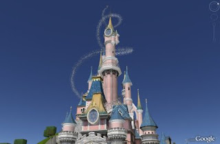

While the buildings are superb, it's really all the other detail that makes this data worth the virtual trip. There are over 500 unique landscape elements that were created to make the park look as realistic as possible. What's more, each attraction has unique plant life associated with that area. For example, palm and tropical plants were used on Adventure Island. Desert-type plants were used in Frontierland, broad leaf deciduous trees were used in Main Street, pine trees were used in Discovery Land and shaped pruned trees were used in Fantasyland. If there were street or landscaping elements in the photographs, they were modeled. This means every bench, light post, tree, bush, planter box, street sign, fence, street curb, fountain, rock, bridge, table & chair are included.
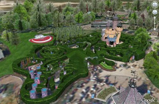

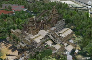
Apparently the photographers rode the Indiana Jones Temple of Peril ride repeatedly in order to "understand the actual path of the roller coaster when modeling the attraction" (a hardship I know, but "just part of the job", they say.) The model includes every loop, turn and climb. At the top of the Sleeping Beauty Castle, you'll spy Tinker Bell, complete with a trail of pixie dust, adding just a little more magic to the layer.

Disney developed a custom KML for each attraction in the two Disneyland Paris Parks, each of the seven Disney hotels and the Disney Village. Simply click on the area of interest and a KML bubble complete with Flash animations and sound will appear. You can navigate from place-to-place using this approach, but my preference is to use my 3D mouse and stroll through the park on my own at ground level.

The Disneyland Paris layer can be found in the "Gallery" folder (note that you need to have Google Earth 5.0 to view the models). The layer is available in six languages: French, Italian, German, Spanish, Dutch and English.

Launched: Tell us why we're wrong

Thursday, May 21, 2009

We're working hard to display the very best 3D models in Google Earth. To accomplish that, we have dedicated, keen-eyed, folks looking at each model in the Google 3D Warehouse that's marked as "Google Earth Ready." If a model looks like a great fit, it's marked as "Accepted." Sometimes, though, a model needs a little more work before it's ready for Google Earth. We give a few tips on how to improve the model so that it may appear in Google Earth later. You can see these tips on your model's page in the 3D Warehouse.

I'll be the first to say that giving feedback for these models is both a science and an art. In other words, we may not always get it right. In the past, this was a problem because folks didn't have a great way to tell us that we're wrong and why. Sometimes, our satellite imagery may be inaccurate, or perhaps your building has no textures on one side because it's in a dense downtown area.

If you think we're totally off our rocker, now there's a way for you to help us correct our mistake. You'll see a link at the bottom of a review that says "Think this review is incorrect? Tell us why we're wrong." Click on the link, and you can send us a note, include a link to an image - whatever you think it takes to get us back on our rocker. We'll look forward to hearing from you.

Cropping photos and models in LayOut

When working with photos and models in LayOut documents, occasionally, you'll need to trim out unwanted information. Fortunately, LayOut provides a simple process for trimming, or 'cropping', images. The way to crop in LayOut is to use clipping masks. Any Google SketchUp model or image can have a clipping mask. Clipping masks can be any shapes drawn with tools in LayOut. For simple cropping, a rectangle is sufficient. Here’s how to do it:
  1. Import an image into LayOut.

    In the File menu, select the Insert… item.

    Then, when prompted, navigate to the file you’d like to insert. Place it on the page roughly where you want it to be, but don’t worry too much about scaling and positioning yet. I typically put off adjusting the image too much until the clipping mask has been applied. Later on, I can use the clipped boundary for aligning the clipped image with other content on the page.
  2. Draw a clipping shape.

    Next, draw a shape for clipping, our image. Any shape can be used, but a rectangle is sufficient to begin with. Select the Rectangle tool from the toolbar and draw a rectangle over the region we would like to keep. In my image below, I want to trim off the little girl’s shoulder in the bottom right corner and remove the map from the boy’s hand. To help me make sure I’m keeping the important parts of the image, I like to make the fill of my clipping shape about 50% opaque so I can see the image underneath.

  3. Create a clipping mask.

    Once you have the rectangle in the right location, you're ready to make it a clipping mask. First, select both the image and the clipping rectangle. Now, in the Edit menu, select Create Clipping Mask.

    Voilà, a cropped image.

    Sometimes, you won't get the clipping mask right the first time. Fortunately, the clipping mask does not permanently alter your image. Double-click on the clipped image and you will see both the clipping mask and the image appear in the screen. Both can be scaled, rotated, or moved. When you click outside the image and the mask, the image will be clipped again. If you change our mind completely about clipping, turn if off altogether. Go to the Edit menu and select Release Clipping Mask.

  4. Scale and position the cropped image.

    Manipulation of the new, clipped image is the same as the image before the clip, except that the manipulation grips now conform to the cropped image boundary. This will help you scale and line up the image with other content on the page.

  5. Other cool stuff.

    Clipping masks will preserve the stroke style and color of the original image. Try adding a crazy dash pattern and color to the image and see what happens when you clip it. Also, we don’t have to restrict ourselves to rectangles. Any single shape can be used as a clipping mask. In the examples blow, I used rounded rectangles and paths as clipping masks.

  6. Try it with a Google SketchUp model.

    In addition to images, clipping masks can also be applied to SketchUp models. Just as with the images, the mask doesn’t permanently alter your model, but it does let you hide some content that might be unimportant for your page. For example, in my model of a park bench, I left a person in the model to show scale. However, in my LayOut document, I can quickly remove the person using a clipping mask, as shown below.

LayOut clipping masks are a simple feature than can produce powerful results - you can hide unwanted geometry from your model or crop a photograph. Once you use them, you’ll find you can’t live without them.

The 3D Warehouse, now in better shape

Wednesday, May 20, 2009

We launched an experimental new feature that lets you find similarly-shaped models in the Google 3D Warehouse. To try it out, go to a model details page and click on "See other models shaped like this". There, you'll see a bunch of models that are similarly shaped.


Not only is this generally interesting, but it'll also help you find stuff that you might miss with a text-only search. For example, this model is similar to this model, but they don't share any text; you might not find the first one, yet it might be exactly what you need. This feature also works well for finding things with a distinctive shape, like biplanes, swivel chairs, and 1960s muscle cars. Maybe the next time you're modeling an interior, you can use this feature to poke around for options when you're selecting furniture.

As fun as this feature is, it's also pretty cool that Google's culture leads to innovations like this. Last year, a few of us from Boulder visited Google's NYC office for an internal conference to see what new and exciting stuff our research crew had been cooking up. In a side conversation with one of the researchers there, I discovered that he'd done a lot of work in the past on 3D shape search. And as luck would have it, an intern who was just starting also had a ton of experience doing this. So a team was born! Following a good deal of work, we've got a new feature for you to play with. Enjoy!

The Four R's: Reading, 'Riting, 'Rithmatic, R-chitecture

Tuesday, May 19, 2009

Earlier this year, Google exhibited at Channel 13's Celebration of Teaching and Learning in New York, NY. I had the opportunity to demo Google SketchUp and meet hundreds of enthusiastic educators - exactly the types of energetic, creative folks that you would want shaping your kids' minds. One of those teachers was Michele Macloud, Instructional Technology Coordinator at Prairieville Middle School in Ascension, Louisiana. Michele watched a demo of SketchUp for the first time and imagined gobs of possibilities. She left the booth assuring me that she would keep me posted. Well, last week I received an email from Michele telling the story of how Prairieville Middle School's 8th graders are using SketchUp to design a new school!

In the few months since I'd seen Michele in New York, Prairieville teacher Sandi Gautreau had been introducing SketchUp to her 8th grade math students. They took it in steps, starting by drawing a dimensionally-accurate model of the classroom. Sandi explained, "Once they learned what they could do and create, they sat and worked. They used trial and error, worked with each other. Students taught each other when they found features of the product. Students asked questions of each other. They were completely engrossed in the application." After developing their SketchUp chops, they began modeling an entire wing of the existing school.

In case you're thinking the students are getting off easy by playing with SketchUp instead of doing "real math", Sandi explains, "Measurement is always a weakness on standardized testing. Students actually went outside and took measurements. They drew objects in SketchUp and were able to compare the scale to the actual measurement."

At that point, the Principal, Ms. Diane Gautreau, and the District Demographics Application Specialist, Mr. Chad Lynch, met with the students. They discussed ideas for a new school, building codes, and what elements to consider to ensure a successful design. Mr. Lynch brought blueprints for an upcoming school to share with students. Armed with this information and their SketchUp skills, students went to work designing a new Prairieville Middle School. Each student chose a different part of the project to design. These parts will be brought together and presented to Principal Gautreau as a design recommendation for a new school.


It looks like Prairieville will have a pretty sweet gymnasium...


Of course, the final word in any classroom-experience belongs to the students. Devin says, "Using SketchUp made math class more interesting". Brittney concurs, "Before this project, math was stressful. It was hard." Kaylyn adds, "Now there is more to look forward to; what I do might be included in the plans for the new school."

And it sounds like Ms. Gautreau may have set Shelby on new a career path, "I learned how architects do their jobs, and it taught me that I could have a career in this field when I get older."

SketchUp is now available in Chinese (Traditional)

Friday, May 15, 2009

As of today, Google SketchUp is available in fifteen of the world's most popular languages. It has taken us a while to get there, but I'm proud to announce that we've just added Chinese (Traditional) to the list of languages we support, along with French, Italian, German, Spanish, Japanese, Polish, Brazilian Portuguese, Russian, Dutch, Korean, Turkish, Czech and Chinese (Simplified). On behalf of all of us out here in Google's Boulder office, I'd like to say "您好" to all of you, and welcome you to the SketchUp user community.

Eric Yam is my new favorite SketchUpper

Monday, May 11, 2009

Maybe it's because I'm a huge space geek, or maybe it's because I'm Canadian, but I find myself tickled pink about Eric Yam. The 16-year-old from Toronto just tied for the Grand Prize in the NASA Space Settlement Contest. Better yet, just about all of the illustrations and diagrams in his 96-page (!!!) report are Google SketchUp models. It's the most exciting space colony for 10,000 people you've seen all year.


You can read all about Eric in this Globe and Mail article from last week. You can even download his report as a full-color PDF. Congratulations Eric – maybe this isn't as far off as most people think.


Champion the 3D Web using COLLADA Contest

Friday, May 8, 2009

(Cross-posted from the SketchUp API Blog)

Our friends over at the Khronos group are holding a Champion the 3D Web using COLLADA Contest. They're looking for the best 3D models, avatars, worlds, or simulations created using COLLADA. Prizes include cash awards and opportunities at a future Immersive Education Initiative in-world (virtual) events. The contest will run through July 15, 2009. Winners will be announced at Siggraph this year in New Orleans. The contest is sponsored by the Khronos Group and the Media Grid Immersive Education Initiative. Please check out the contest site for full details.

Using SketchUp to enter the contest

SketchUp can be used to create models for this contest. SketchUp Pro and the Pro trial version both export COLLADA (DAE) files directly. The free version of SketchUp can export Google Earth (KMZ) files which contain a COLLADA model. To extract a COLLADA model from a KMZ file follow these steps:

  1. Export your SketchUp model to KMZ.
  2. Change the file extension from ".kmz" to ".zip".
  3. Double-click on the ZIP file.
  4. Double-click on the "models" folder.
  5. Locate the DAE file. Copy and paste this file to your Desktop.
  6. Check your file's appearance in a COLLADA viewer like Swirl X3D Viewer©
  7. Submit your model to the contest.

Fun with kitchens and baths

Wednesday, May 6, 2009

Members of the SketchUp gang just got back from K/BIS 2009 in Atlanta. K/BIS is the annual Kitchen & Bath Industry Show & Conference, and it's HUGE – miles of glitzy trade show booths, stuffed with fancy appliances and staffed by attractive spokespersons in uncomfortable heels. The five of us stood out like sore thumbs, but we like it that way.


We brought a small booth to show kitchen and bath folks how they can use the goodies in SketchUp Pro 7 – and LayOut in particular – to convince their clients to use their design services. We also made a lot of great contacts from product manufacturers who would like to add their product catalogs to the Google 3D Warehouse. If you haven't already done so, our ever-growing Kitchen & Bath collection of models is worth checking out.

Images courtesy Classic Kitchens and Baths (left) and Igloo Studios.

Posted by Aidan Chopra, SketchUp Evangelist

Broadway Malyan uses the IES VE SketchUp plugin for sustainable design

Monday, May 4, 2009

Broadway Malyan, a multidisciplinary international firm, has been giving the IES VE SketchUp plugin a real workout. Using Google SketchUp Pro, Integrated Environmental Solutions Virtual Environment software, and the plugin, Broadway Malyan is able to integrate sustainable design throughout their entire design process. Besides pioneering the use of the plugin, the firm is also proving, on real world projects, that good design is sustainable design.

Below is just a part of the case study - visit the case study online to read the story in its entirety (and see more images).

Resource efficient design, technically informed staff, and innovation are key company values for Broadway Malyan. Established in 1958, Broadway Malyan is a leading international practice of architects, urbanists and designers with offices throughout the UK, Europe, the Middle East and Asia.

Kevin Leahy, main board Director of Broadway Malyan UAE stated, "Broadway Malyan is passionate about making sustainability fundamental throughout the design process and believes that the IES/SketchUp interface demonstrates an innovative way to adopt and embed new approaches and methods of working as part of a joined up, integrated team effort.”

Since its launch in August 2008, Broadway Malyan has been piloting the use of the IES VE SketchUp plugin on key projects from the London and UAE offices, including single dwellings, large masterplanning, streetscaping and mixed use developments.


“In many ways the interface was what we had been waiting and looking for,” commented Stephen Choi, head of the Sustainability unit at Broadway Malyan. “We had tried many of the currently available interfaces between CAD design and energy/performance analysis tools, but none had offered the tightness and truly iterative capabilities we were looking for.”


“The best part of Google SketchUp is the iterative, very tactile and malleable modeling capabilities; the best part of IES is the variety and depth of analysis capabilities. Combined, you get the best of both worlds – the capability to undertake faster more effective energy and performance analysis in an integrated and iterative manner that works truly as part of the design process,” continued Ian Walker, head of Environmental Engineering, Broadway Malyan. Continue reading the case study....