SketchUp 7.1 in even more languages
Friday, January 29, 2010
Madrid goes 3D!
Thursday, January 28, 2010
The City of Madrid contains scores of beautiful structures ranging from art museums and classical monuments to palatial government buildings. The prevalence of architectural wonders may explain why passionate geo-modelers have created thousands of models there (using both Google SketchUp and Google Building Maker) -- the largest concentration of 3D models anywhere the world!
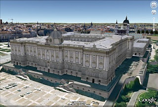
To start your virtual tour, I recommend you fly to El Palacio real de Madrid (Royal Palace of Madrid), the official residence of the King of Spain. From there I'd fly over to the Puerta de Alcalá, a famous classical monument located in the Plaza de la Independencia (Independence Square), and then over to the Monumento a Alfonso XII en el Parque del Buen Retiro, a beautiful monument that is among the greatest in Europe.
And don't miss the Plaza de Cibeles where the famous statue Fuente de Cibeles is surrounded by trees and beautiful buildings, including the stunning Palacio de Comunicaciones(Madrid City Hall) and Banco de España (Bank of Spain) buildings.
If I were to visit Madrid for real, I think I'd want to stay at the Palace Hotel, which is a short walk to the famous Prado Museum (one of my all-time favorite models in Google Earth) where you can fly inside and experience the great works of art.
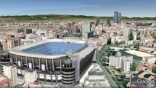
Fútbol (American soccer) fan? Madrid is the home to Real Madrid, who play in the Estadio Santiago Bernabéu. Olé
Posted by Bruce Polderman, Product Manager
Useful updates to 3D Warehouse and Building Maker
Wednesday, January 27, 2010
Some common ones include:
- Too much geometry: You've modeled a building in more detail than we're able to use.
- Corrupt image file: One of your photo-texture images isn't a valid JPG or PNG image.

In many cases, the information provided in the feedback section will be enough for you to identify the problem and fix it. Otherwise, we plan to release Help Center articles to walk you through the steps required to repair your model. We hope the additional feedback helps.
Additionally, we've made some changes to Building Maker to help fix a common texturing problem. Many of you have built models only to have them returned with an "Incomplete Texturing" feedback notice. You then take a closer look at the model and realize one or more of the faces are black. What happened? Usually, this problem occurs when the model hasn't been constrained in enough images. Building Maker will now check your model for these faces before you submit it, and warn you if the model needs additional constraints. No waiting!
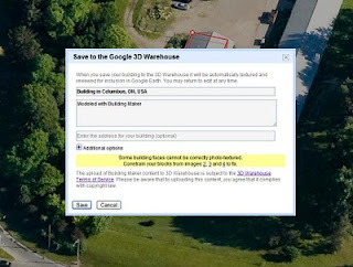
Enjoy, and please (as always) let us know what you think.
Posted by Allison Floyd, 3D Warehouse Engineer
What can architects do for Haiti?
Tuesday, January 26, 2010
"Hurricane season runs from 1 June through November 30. That means that in alittle over 4 months a great many earthquake victims could be at seriousrisk once again. How does Haiti start to house its citizens? It would seemthat there is an immediate need to design suitable structures to replacewhat was destroyed by the earthquake. Could the SketchUp community bemobilized to help? How do we excite AIA members in much the same way themedical community has become involved in Haiti?"
I'm sure many of you have been wondering the same thing. Aside from giving money (which is still the best thing most of us can do for now), how can architects and other designers do something to help?
Luckily, there are folks who are working to answer exactly this question: Architecture For Humanity is an aid organization that specializes in bringing international design knowledge and experience to bear on situations exactly like the one in Haiti. If you're an architect and you're looking for ways to become involved in relief efforts, I recommend you join AFH's worldwide community. To learn more about AFH's response to the Haitian earthquake, take a look at this blog post: Haiti Quake: A Plan for Reconstruction.
Another thing SketchUp and other geographically-minded people can do involves using Google Map Maker to draw current maps of the country. Accurate geographic information is critical to recovery efforts, and it's something that can be done right now. There's an effort on to do just that: surf over to Map Haiti to learn more.
Posted by Aidan Chopra, SketchUp Evangelist
LayOut 2.1 gets its very own book
- importing and exporting
- updating models
- templates (modifying existing ones and creating your own)
- layers and pages
- drawing tools
- standard views and scales
- dimensions
- labels and text
- clipping masks
- rendering (raster, vector, and hybrid)
- scrapbooks
- hatches and fills
- cutaway views
If you have SketchUp Pro, check out Bonnie’s book and see what you’ve been missing in LayOut. If you haven’t upgraded to SketchUp Pro 7, or you need to purchase a license, please visit the SketchUp Pro store.
Posted by Laura Allen, Sales Operations Coordinator
Enter the CustomMade furniture design competition
Monday, January 25, 2010
The folks at CustomMade.com are hosting a custom furniture design competition, and they've specifically suggested that participants use Google SketchUp to design their entries. The winner will have his or her piece made by one of CM's woodworkers using Rockler tools and supplies.
The deadline for entries is February 12, 2010, so get cracking. You'll be competing against me -- there's a minimalist half-cantilevered slab desk with a cable trough that I've been imagining for my den.
Posted by Aidan Chopra, SketchUp Evangelist
A discussion about creating construction and working drawings with LayOut
Friday, January 22, 2010
A couple of caveats before you make the jump:
- Since the thread has been going for over a year, many people’s opinions are based on the version of LayOut that they were using at the time of their post, including the Beta version. Please pay attention to the date of the post as well as its content.
- The SCF are great because they cater to SketchUp experts and novices alike, and the members are a talented and passionate bunch. As such, you’ll see a healthy debate and, occasionally, strongly-worded comments. SCF contributors are often our biggest supporters as well as our most outspoken critics.
Now that that’s out of the way, enjoy the thread – all 11+ pages of it!
Note: If you’re not already a SketchUcation member, you’ll want to sign up to get access to all of the example images and files.
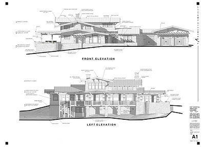
Image courtesy of Tebbs Design Group
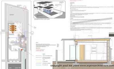 Image courtesy of Paul Lee
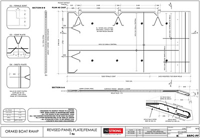
Image courtesy of NZ Strong Construction
Posted by Chris Cronin, SketchUp Team
Connecting SketchUp Scenes to LayOut Templates
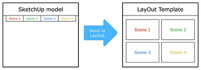 This technique allows you to auto-populate a LayOut Template with a set of Scenes from a SketchUp file. (Click to enlarge)
The key is to use Scenes in SketchUp that correspond to specific viewports in a LayOut Template. LayOut will automatically populate each viewport with the right model. Confused? Read on for a concrete example...
Let's say you're a furniture designer who always needs to produce a three-page brochure for each new piece you design. The three pages are:
- Page 1: Glossy Perspective View
- Page 2: Isometric View
- Page 3: Orthographic Views (Top, Front, Side)
Getting set up in SketchUp
The first thing you need to do is create a SketchUp Template that you can use for each furniture piece:
- Start by opening a new SketchUp file.
- Import a furniture model; you'll use this to set up the Template you're making.
- Create a Scene for each of the views you want to show in your brochure. In this case, there are five: Perspective, Iso, Top, Front and Side.
- Save your file as a Template by choosing File > Save As Template... from the menu bar. Call it "Furniture Brochure Template".
- Save your file somewhere on your computer. Call it "Furniture Brochure Working File.skp".
Getting set up in LayOut
Every brochure you create will be exactly the same except for the furniture and a bit of text. The logo, the contact info and the general layout shouldn't change. After all – your brochures are part of your brand identity. Since you're about to create numerous LayOut documents that are all very similar, you (wisely) choose to create a custom Template. You start by creating a new three-page document that looks like this:
 Create a LayOut document with placeholders for the Scenes you created in SketchUp. (Click to enlarge)
Once your Template is designed, here's what to do next:
- Insert the SketchUp model file you created earlier.
- Place a different view of the model in each of the five areas of your LayOut document.
- For each, scale the bounding box to fit, then assign a Scene using the Scene drop-down menu in the SketchUp Model dialog box.
- For the orthographic views (Top, Front and Side) on page 3, you can also assign a scale – in this case, 3/4" = 1' (1:16).
- Now save your LayOut document as a custom Template: Choose File > Save As Template... from the menu bar. Call it "Furniture Brochure Template 1".
 When you "Send to LayOut", the Scenes from SketchUp auto-populate the LayOut Template you created. (Click to enlarge)
Using your new workflow
Now that you're all set up, you can start saving time. Here's how to proceed:
- Open a new SketchUp file using the Template you created earlier. In this case, that's "Furniture Brochure Template". You can choose to start with a specific Template from the Welcome to SketchUp dialog box (Help > Welcome to SketchUp).
- Replace the stand-in model in the Template with the model you'd like to feature in a LayOut brochure.
- Go through each Scene and make sure your model looks right and fits properly in the modeling window. Zoom, Orbit and Pan to correct the view, then Update the Scene.
- Save your SketchUp file.
- Choose File > Send to LayOut from the menu bar.When LayOut opens, find and choose the LayOut Template you created earlier. In this example, that's "Furniture Brochure Template 1".
- Go through your LayOut document and check to make sure the new model looks right in each viewport. Where it doesn't, correct the view.
- Add custom text, labels, dimensions, graphics and photos to complete the document.
 A brochure in LayOut created with another piece of furniture (Slinky Occasional Table by Maxime Garcia – moboille on 3D Warehouse) (Click to enlarge)
Posted by Aidan Chopra, SketchUp Evangelist and Barry Janzen, QA Engineer
Take a virtual tour of the Olympics in 3D
Tuesday, January 19, 2010
Last month, we introduced photo-realistic 3D models for eight of the nine venues hosting the games.
Today, we released updates to many of the models using higher-resolution imagery, and, the last venue for the Olympics: the Bobsled Course!
With today's release, all nine venues (54 buildings in total) are completely modeled in 3D and available for viewing in Google Earth's "3D Buildings" layer (or view the collection in the Google 3D Warehouse). The collection includes 3D models that range from downtown event centers to ski lifts and spectator bleachers.
In addition, the Vancouver Organizing Committee for the 2010 Olympic and Paralympic Winter Games incorporated the models into the Official website using the Google Earth plugin. To see the models, simply click on "Spectator Guide," then "Venues." You'll find a "3D View" tab that loads the 3D model. So wax your virtual skis and take a tour!
Posted by Bruce Polderman, Product Manager
Cincinnati now in 3D
Friday, January 15, 2010
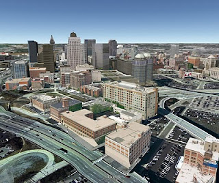
This city is a great example of how multiple sources have been used to populate Google Earth with 3D buildings. The city contains a large number of user-generated models (made with SketchUp), Google-generated models, and untextured 3D models contributed via the Cities in 3D Program. Have fun exploring Cincinnati in 3D!
Posted by Bruce Polderman, Product Manager
Cross Media artist uses 3D Warehouse for electronic performance
Thursday, January 14, 2010
He sees 3D models on Google 3D Warehouse as a new medium for expression. "Google 3D Warehouse is my art space. It's a virtual playground full of dreams and visions of this age. I decided to do a kind of virtual performance there."
Max is exploring. His models are personal, electronic/artistic interventions in the flow and exchange of virtual reality. "The Warehouse is a launchpad for my downloadable sculptures. When my creations are downloaded, they start an adventurous journey -- like crew members of the world's virtualistic dreams -- moving from computer to computer around the planet. The models get injected into peoples' virtual contexts. They participate in missions conceived and brought to life by anyone. In a sense, they become entities in a global performance and are the most far-flung expression of my art."
Max was an artist from an early "One day, when I was three or four, my family got a little table with a slate board. With a chalk piece in my hand, I started to draw my experience on the surface of the dark stone. This was the beginning of this what i am now."
Max is Swiss and grew up in a working class family near Zurich. While he didn't excel in academics, his drawing and painting skills saw him through a degree in Fine Arts. He has done freelance illustration in advertising and publishing to fund his art. In fact, Max conceived NZZ-Folio's cover concept, which now has a cult following. For many years Max has evolved his "personal artistic language."
Electronic expressions of this language often take the form of his persona (complete with blue jump suit and green hat) in various poses and a variety of associated objects, like firehouses, flags and parachutes. His collection Downloadable Sculptures has subcollections reflecting the artist's interests: working class heroes, firefighters, and one of his most interesting endeavors: "My Private Space Program".
Max took his first steps into the virtual environment in 1995. Of course, he'd worked for years with clay, paint, brushes along with 2D design software. Working in 3D electronically was a revelation. "The XYZ axis controller in my 3D applications became my existential trinity of head, heart and hand. Virtuality is always the root of my ideas and projects. But the way I realize them, I try to keep absolutely free from a proscribed process. In all art, the final realization, whether it's as a real sculpture, painting, print or animation are is subordinate to what I am trying to say."
As far as 3D software, Max often works with Maxon Cinema 4D, Google SketchUp and 3D Coat. He likes the free modeling and deforming tools in Cinema 4D which easily convert in finished form to SketchUp models as a final step before they launch out to the world via the 3D Warehouse. Astronauts and Cosmonauts are the starkest metaphor for Max's vision. His "Private Space Program" of which these models are realizations, "travel beyond the screen as emotional symbols of my own breakup in virtual space--metaphors of my impressions as a human being and artist. The space suit is a reversed visualization of my own barriers, boarders and armor inside myself."
Without a doubt, Max's models represent one of the most unique uses of the Google 3D Warehouse and invite all of us into a new kind of world!
Posted by James Therrien, Google Geo Team
A new year, a new SketchUp build
Wednesday, January 13, 2010
For those of you using our French, Italian, German, Spanish and Japanese translated product, this release of SketchUp 7.1 is also available in your language. We'll have more languages to release in the coming weeks as well.
If you're still running a SketchUp 6 build or something even older, now is a great time to upgrade. If you just can't let go of that SketchUp 6 install, we're going to issue a similar maintenance release for you in a couple weeks. But be warned: we can't keep fixing SketchUp 6 indefinitely, and will be moving our attention forward to the next major SketchUp release soon.
Posted by John Bacus, SketchUp Product Manager
See recent models in Building Maker
When viewing one of the available locations in Building Maker, you'll notice that a number of blue markers appear on the map. These markers are visual indicators where buildings have recently been modeled. We introduced them to help prevent collisions where multiple people are modeling the same building and to enable users to see where active modeling is occurring. Since the blue markers only represent recent models, it's always a good idea to view a building with the "Earth" button prior to modeling to ensure that one doesn't already exist.
You'll also notice that the blue markers are clickable. If you click one, it will display a pop-up that identifies the name of the model and its author. The pop-up also contains a "Create building nearby" link, that switches the view to the "Editor" mode where you can begin modeling. If you happen to be the author of that building, it will also contain an "Edit this building" link.
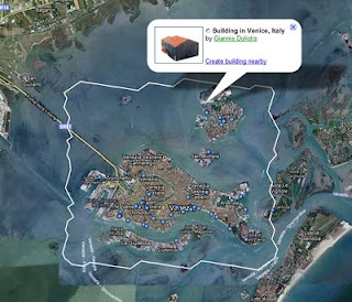
As a reminder, if you see a city that contains a blue boundary, don't let that stop you from modeling there. If you publish a model of equal or greater quality (more detailed) than ours, we'll replace it. The other benefit of publishing Building Maker (or SketchUp) models where existing auto-generated models from Google exist, is that you can attach metadata (address, description, etc) to them, thus making the new building clickable.
Last but not least, you'll also notice that two new cities were added to the list: Milan, Italy and Miami, Florida. Happy modeling!
Posted by Bruce Polderman, Product Manager
SketchUp: a 3D Toolbox
Tuesday, January 12, 2010
Learn how to create 3D models of buildings, sculptures, furniture and anything else you can imagine using Google's free modeling program, SketchUp. Your host, Cameron Harris, will walk you through the application's interface, teach you its tools, and work with you on projects.
Cameron is the co-creator of the Harwood Podcast Network. He's been using SketchUp since version 5 and has modeled the Network's Studio facilities, with all its sets, furnishings and details. He is currently modeling the set and camera angles for a new music show, "Live From Bay 6".
Posted by Chris Cronin, Google SketchUp Team
Popular Woodworking in the Warehouse
Friday, January 8, 2010
I was intrigued, so I contacted Bob Lang (the Senior Editor) to ask him the reason for providing such a robust collection of models. He says that using Google SketchUp has changed the way they design projects and it's a "tremendous advantage for a woodworker to be able to build a project on screen before heading to the shop".
Bob says it seemed natural for them to upload designs from the magazine to the 3D Warehouse; that way, people can "pull the models apart" to gain a more intimate understanding of the project's details. Although the folks at Popular Woodworking have built some of the models themselves, most are created by their readers – it's truly a community of shared ideas.
As PW's audience asks for more and more digital content, free, user-friendly tools like Google SketchUp and the 3D Warehouse fit the bill perfectly: Bob told me that he's gained new readers who discovered Popular Woodworking through its models in the 3D Warehouse. Here's some of what's available:


Look who's modeling!
Thursday, January 7, 2010
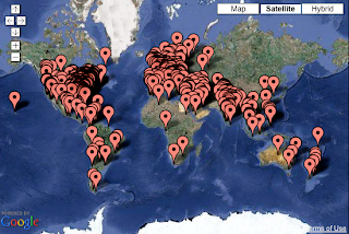
Folks in Iowa, Colorado, and British Columbia are motivating community members by building their own websites, garnering local press, tweeting, and soliciting help in online forums. Some are offering training on how to model to anyone interested. Iowa is asking middle and high school educators to form and advise teams of students.
There are still many people looking for team members. Visit the official group to meet folks in your area, or to post your own questions, ideas, or comments about the competition. The deadline for entering is March 1st of this year. Start the entry process by adding a pin to the map on our Get Started page and follow us on Twitter @modelyourtown.
Posted by Allyson McDuffie, Model Your Town Competition Team
Competition winners visit NYC
Wednesday, January 6, 2010
We met both Davids and their significant others at Google’s New York office, ate a spectactular amount of food, then went on a tour. Between the giant freight elevators (the building used to house buses and trains for the city), the well-stocked microkitchens (another handful of mixed nuts, anyone?) and the Lego playroom (everyone knows that geeks love Lego), I think everyone came away with a good idea of what it’s like to work there. Danish David mentioned that it aligned well with his expectations. We’re glad : )

After Google, everyone jumped into a few cabs and we traveled uptown to the Solomon R. Guggenheim Museum. David van der Leer (the Assistant Curator of Architecture and Design) took us around the building. As one of the people most responsible for last summer’s Frank Lloyd Wright show, we couldn’t have asked for a better tourguide. Better yet, the museum was closed on the day we were there – we had the place mostly to ourselves.
An interesting fact we learned on the Guggenheim tour: Near the top of the ramp that spirals up through the building, the pattern of the travertine floor abruptly changes from circles to rectangles. This marks the precise point in the construction when FLW passed away. It seems that without him around to supervise, the builders switched to an easier method. Keep an eye out for it if you get the chance to visit.
Congratulations again to both Davids, and thanks to everyone who participated. The results far exceeded our expectations.
Posted by Aidan Chopra, SketchUp Product Evangelist
